



Across the eCommerce brands we work with, mobile typically makes up around 2/3 of website traffic. Yet we still regularly see mobile treated as a responsive afterthought: the same content hierarchy, components, and purchase logic designed for desktop, compressed into a much smaller viewport.
The broader usability data reflects that gap. Baymard Institute's analysis of tens of thousands of product pages found that only about 38% of mobile PDPs reached a "decent" usability rating, compared with roughly 48% on desktop. Mobile cart abandonment also sits considerably higher, at around 85% versus 73% on desktop.
In this article, we look back at a recent product page audit for a cross-border home appliance brand. The interesting part was not that the site lacked standard eCommerce features. Many of them were already there: sticky add-to-cart controls, product specifications, promotional elements, shipping information, and comparison functionality had all been implemented.
KEY TAKEAWAYS
- Mobile typically accounts for 75% to 90% of eCommerce traffic, yet mobile UX is often treated as a responsive version of the desktop experience rather than designed around mobile behavior.
- Conversion friction often comes from features that exist but are difficult to find, use, or act on.
- The fix is not always adding more functionality. It is making the purchase path clearer, easier to use, and easier to complete.
For this audit, we focused on six parts of the mobile purchase experience:
| Area | Research question |
|---|---|
| Above-the-fold experience | How quickly can a mobile shopper understand the product and reach the purchase action? |
| Popups and overlays | Are promotional elements helping the sale or competing with it? |
| Sticky add-to-cart | Does the mobile shortcut actually shorten the path to purchase? |
| Shipping and warranty | Can shoppers find decision-critical information when they need it? |
| Content and tap targets | Is the PDP genuinely usable on a small screen, not just responsive? |
| Comparison and add-ons | Can shoppers compare options and discover relevant extras without friction? |
The friction came from how those features worked on mobile. Some took up too much space, some were difficult to discover, and others did not behave in the way shoppers would reasonably expect. Let's look at the findings.
TMO Group is currently recruiting eligible brands to join our eCommerce Conversion Rate Optimization (CRO) Pilot Program. We are offering zero-cost product page audits and actionable optimization recommendations.
1. Above-the-Fold Clutter
Mobile screens leave little room for competing information. For this brand, repeated product selectors and secondary content occupied most of the initial viewport, pushing the primary purchase action further down the page. In practice:
- Repeated specification selectors took up most of the above-the-fold space.
- Users had to scroll approximately one and a half screens before reaching the “Buy Now” button.
A standard conversion report might show this as a weak add-to-cart rate, but it cannot tell you whether the problem is purchase intent or something much simpler: the purchase action is difficult to reach in the first place.
For mobile product detail pages (PDPs), the first viewport should prioritize the information needed to understand the product and move toward purchase. Secondary specifications can remain accessible without competing with the primary CTA.
2. Popups Blocking the Buy Box
Promotional overlays have a much larger footprint on mobile. When they cover pricing, product configuration, or the primary CTA, a marketing mechanic intended to capture leads starts competing with the purchase itself.
We have seen this problem take several forms in eCommerce audits: full-screen subscription prompts, floating promotional banners, and widgets that repeatedly expand as the user moves through the page.
xBloom offers a useful implementation pattern. Its $100 gift card signup initially appears as an overlay, but once dismissed it collapses into a narrow tab at the edge of the screen. The promotion stays accessible without continuing to obstruct the price or “Add to Cart” button.
| State | What the User Sees |
|---|---|
| Popup open | A "$100 gift card" subscription popup covers the price and buy button |
| Popup dismissed | The popup collapses into a compact vertical tab on the right edge. Price and "Add to Cart" stay visible, and the offer remains one tap away |
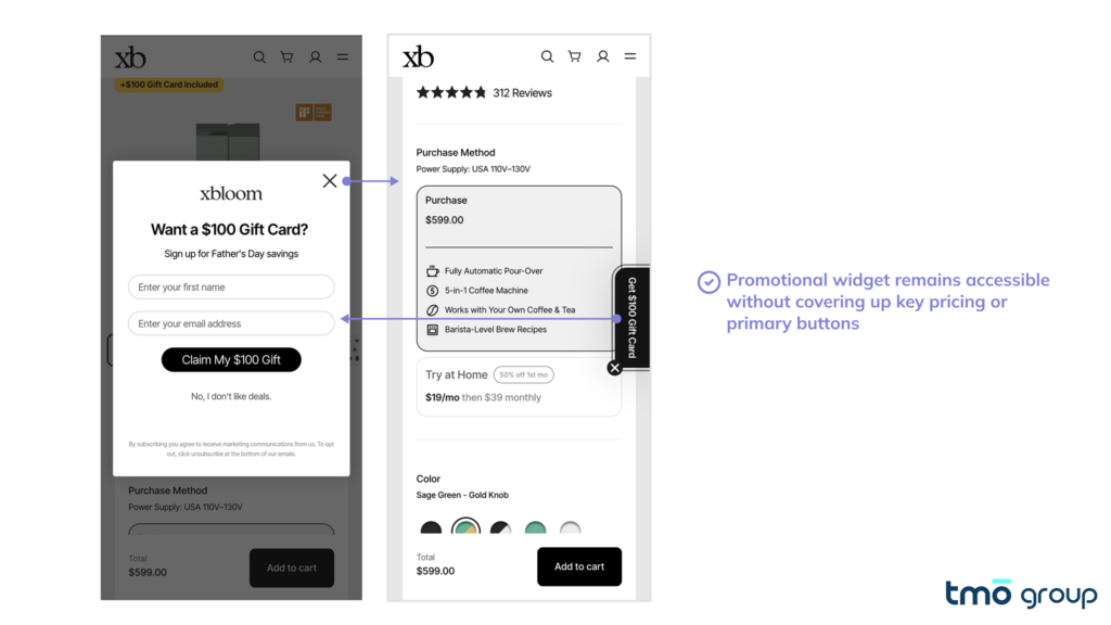
The principle is straightforward: promotional elements should remain secondary to the purchase path. On mobile, check not only whether a popup can be dismissed, but what happens afterwards. Does it stay out of the way? Does it reappear while scrolling? Does its close control interfere with navigation or other tap targets?
These details are easy to overlook in a desktop review, but on a constrained mobile viewport they can create repeated interruptions around the most commercially important part of the page.
3. Sticky Add-to-Cart Bars Don't Behave As Expected
On a mobile PDP, a sticky buy bar should keep the primary purchase action within reach after the shopper scrolls past the main buy box.
In the home appliance store, the layout already had a persistent "Add to Cart" button fixed to the bottom of the screen. But session recordings showed that the interaction did not work as shoppers appeared to expect:
- Tapping "Add to Cart" did not add the product. It scrolled the shopper back to the main buy box.
- After the jump, the actual "Buy Now" controls were still outside the visible mobile viewport.
- Recordings showed users repeatedly tapping the sticky button, apparently trying to trigger the add-to-cart action.
A component intended to shorten the purchase path was therefore introducing another step.
This is an important distinction when auditing mobile UX. The presence of a sticky CTA does not tell you whether it is reducing friction. Check what happens after the tap, whether the resulting action is immediately visible, and whether the behavior matches what the button label leads shoppers to expect.
Suspect your store's mobile UX might be affecting conversion rates? Our eCommerce Optimization Services are designed to audit, identify and prioritize revenue-impacting opportunities for D2C brands.
4. Shipping and Warranty Info Buried Too Deep
Shipping, returns, and warranty terms often influence whether a shopper is ready to buy. On mobile, that information needs to be discoverable without forcing users away from the purchase context.
Baymard's mobile usability research found that 26% of eCommerce sites move some PDP content to separate sub-pages. Its testing also found that users can overlook those links entirely, making important product and policy information harder to discover.
We see a similar signal in eCommerce audits. Buyers frequently move from product pages to help or FAQ content before completing a purchase. When the same questions repeatedly send users away from the PDP, it is worth checking whether decision-critical information is surfaced clearly enough where the purchase is happening.
Ratio Coffee provides a useful implementation example:
- Directly below "Add to Cart," the PDP states: "Free shipping on orders over $95, ships same day if ordered before noon."
- Further down the page, three compact trust signals cover free ground shipping, a five-year warranty, and a 30-day satisfaction guarantee.
- The information remains part of the natural PDP scroll rather than requiring the shopper to find a separate policy page.
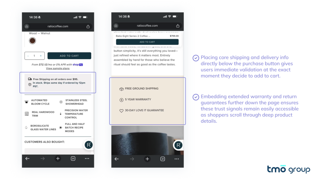
The objective is not to move every policy detail next to the buy button. Surface the information most likely to affect the purchase decision, then provide access to the full terms for shoppers who need more detail.
5. Content Density and Tap Targets
Mobile usability is not only about what information appears on the page. Shoppers also need to be able to read it comfortably and interact with controls without repeated zooming or mis-taps.
Tap-target sizing is one useful benchmark. Apple recommends touch targets of at least 44×44 points, while the Web Content Accessibility Guidelines (WCAG), which define accessibility criteria for web interfaces, use 44×44 CSS pixels for their enhanced target-size criterion.
We previously wrote about this in our overview of another audit for an outdoor gear brand, where we sampled key interactive elements across the mobile experience and found that nearly half fell below that benchmark.
These issues are not specific to outdoor gear. They become particularly noticeable in spec-heavy product categories, where mobile PDPs need to accommodate product details, reviews, selectors, comparison controls, and purchase actions within a limited viewport.
To illustrate what stronger execution can look like, we looked at several product pages outside the home appliance category. Anker, SureFire, and Nitecore use different approaches, but each demonstrates a useful mobile pattern:
- Anker: clearer grouping and spacing make a specification-heavy PDP easier to scan.
- SureFire: review content remains readable without requiring pinch-to-zoom.
- Nitecore: comparison controls and add-to-cart buttons provide larger, easier-to-hit tap targets.
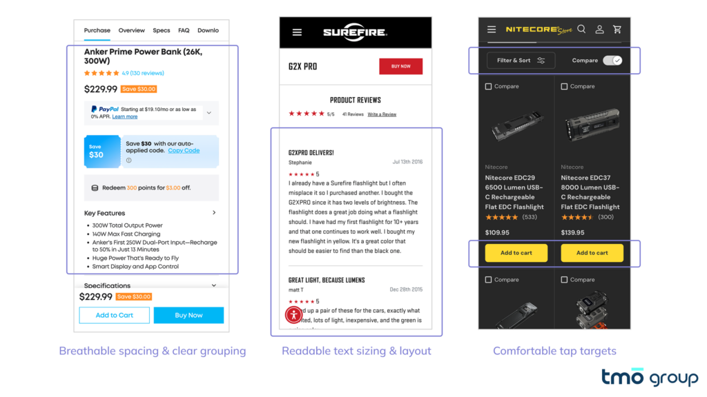
Examples from Anker, SureFire, and Nitecore show how spacing, readability, and interaction sizing can be handled across other spec-heavy product categories.
The category may change, but the audit question is the same: can shoppers comfortably read and interact with the page on the device they are actually using? A layout can technically be responsive while still creating unnecessary interaction friction on mobile.
6. Comparison and Add-On Merchandising Break Down on Mobile
For categories where shoppers compare across models such as small appliances, outdoor gear, consumerFor categories where shoppers choose between similar models, such as appliances, outdoor equipment, and consumer electronics, the PDP has two additional jobs: help the shopper select the right product and make relevant add-ons easy to evaluate.
Comparison functionality is particularly important in these categories. Baymard's research found that around 67% of users in spec-driven categories used comparison features, while 17% of tested sites did not provide one.
But simply having a comparison tool is not enough. It is not the first time when we audit sites where mobile implementations introduce problems such as:
- Comparison tables rendered as static images, leaving specifications too small to read comfortably on a phone.
- Multiple products displayed within one module but without individual interactions, making it difficult to act on a specific model.
Similarly, we came across another example where Desktop implementation seems reasonable but degrades for Mobile: accessories and extended warranties. Order data showed low attach rates, while the PDPs gave shoppers little help understanding why an add-on might be useful:
- A disproportionate share of orders contained only the base product.
- Accessory and warranty sections had limited descriptive copy, imagery, or links to additional information.
This is where looking only at conversion rate can hide part of the problem. Comparison friction can make the core product harder to choose, while weak add-on merchandising can suppress average order value even when the shopper still converts.
For mobile PDPs, evaluate both sides of the decision: can shoppers confidently choose between the available products, and can they understand which additional products or protections are relevant to that purchase?
Apply for TMO Group's CRO Pilot Program
Industry research has already documented mobile ecommerce best practices in detail. What real projects show us is different: having these features doesn't mean they're actually working. Sticky buy bars can add extra steps. Comparison tools can be unusable on mobile. Spec sheets and accessory information can be buried too deep for users to find.
These aren't dramatic failures, they're small pieces of friction that quietly raise the cost of getting from product discovery to purchase, ultimately eating into add-to-cart rate, checkout conversion, and average order value.
TMO Group is currently offering a zero-cost CRO Audit for eligible D2C stores. You will receive:
- Conversion Barrier Analysis: Locate where and why visitors drop off.
- UX & Usability Assessment: Identify friction points in the user journey.
- Annotated Screenshots: Visual breakdowns of key issues with clear explanations.
- Prioritized Action Roadmap: A plan sorted by impact and effort.
- Quick-Win Recommendations: Immediately actionable improvements.

FAQ
It's rarely one issue, usually a mix of crowded layouts, hidden CTAs, blocking popups, buried policy info, and poor tap targets working against each other.
Above-the-fold density, CTA visibility, sticky bar behavior, discoverability of shipping/returns info, text and tap-target usability, and comparison/accessory features.
Apple recommends 44×44 points minimum; WCAG 2.2 sets the same 44×44 CSS pixels as its AAA "Target Size (Enhanced)" standard. Larger targets mean fewer mis-taps on high-frequency actions like add-to-cart.
Spec-driven categories rely on comparison to decide between models. On mobile, the tool needs to be legible, distinguish models clearly, and let users act directly on the one they want.
Average order value. Poor visibility into accessories, warranties, or bundles suppresses attach rate even when core conversion looks fine.