

The global outdoor equipment e-commerce market continues to grow, with camping gear, hiking equipment, and hunting tools increasingly sold through online channels. Despite being a performance-led product category, research indicates that over 80% of consumers are willing to purchase sports and outdoor products online. However, many mature D2C brands face a common dilemma: they have plenty of traffic, yet first-time conversion rates remain stagnant.
Drawing on the insights from our UX and conversion rate optimization (CRO) audit for a global D2C brand specializing in high-performance lighting equipment, this article breaks down the five most common friction points where premium sports and outdoor sites lose potential customers.
TMO helps D2C brands with eCommerce Conversion Optimization Services that help identify UX friction and prioritize conversion opportunities.
1. Excessive Information Density Above the Fold on PDPs
In our audit, product detail pages (PDPs) showed low engagement across the board. Mobile users spent very little time on the page.
The issue wasn't missing content. The brand had the basics covered: feature descriptions, lifestyle imagery, technical specs. The problem was that the above-the-fold purchase zone tried to do too much at once:
- Pricing and promotional callouts
- Membership benefit details
- Product feature highlights
- Multiple purchase CTAs: Add to Cart, Buy Now, and Buy on Amazon
When all of this competes for attention in the same visual space, no single element wins. At the critical moment when a user is ready to act, they face an unclear next step.
On mobile, there was a compounding issue: even after users scrolled past the main CTA, a persistent sticky bar at the bottom continued displaying the same purchase options. Multiple parallel purchase paths crowded into a small screen create unnecessary decision friction.
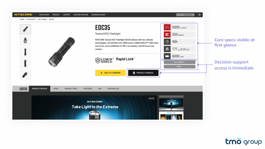
Brands like Fenix and Nitecore use a much clearer information hierarchy. For the Nitecore EDC35, key specifications are visible immediately, and the primary CTA has clear visual dominance, with shipping and compatibility info placed close to the purchase area rather than buried deep in the page.
A useful reference sequence for PDP layout:
| Section | Content |
|---|---|
| Product name and core value proposition | One sentence on what problem this solves |
| Key specs overview | The 3–5 parameters most critical to purchase decisions in this category |
| Pricing and promotions | Presented cleanly, without competing visually with other elements |
| Primary CTA | The most visually dominant action on the page |
| Assurance information | Returns, warranty, shipping directly beneath the CTA |
This is not a universal formula. The optimal order depends on category, user profile, and brand context.
2. Critical Information Is Buried Too Deep
This was one of the most significant findings in our audit, and one of the most common issues we see on spec-driven D2C sites.
Scroll depth data from the client site showed that roughly half of users stopped scrolling once they reached the bundled product recommendation section. Only a small fraction ever made it to the technical specifications section. In practice, most users left the page without ever seeing the specs the brand had carefully put together.
For a product aimed at professional or semi-professional users, this represents a serious information gap. These are exactly the buyers who need spec data to complete their decision, like brightness levels, beam type, IP rating, charging method, rail compatibility.
Common page-level problems include:
- Technical specifications placed at 70–80% scroll depth as a standalone section
- FAQs and compatibility notes at similar depth
- User reviews containing high-value real-world feedback, also invisible to most visitors
Baymard Institute's large-scale product page usability research consistently shows that purchase decisions on PDPs are heavily dependent on users' ability to quickly access the information they need. In high-AOV, high-complexity categories, this effect is especially pronounced.
The solution is changing when critical information appears:
- Surface a core specs summary (brightness, IP rating, battery life, compatibility) at or just below the fold
- Reorganize FAQs and compatibility details into accessible accordion modules near the purchase zone
- Reduce the page's dependence on uninterrupted top-to-bottom scrolling as the only navigation model
3. Unclear Navigation and Categorization
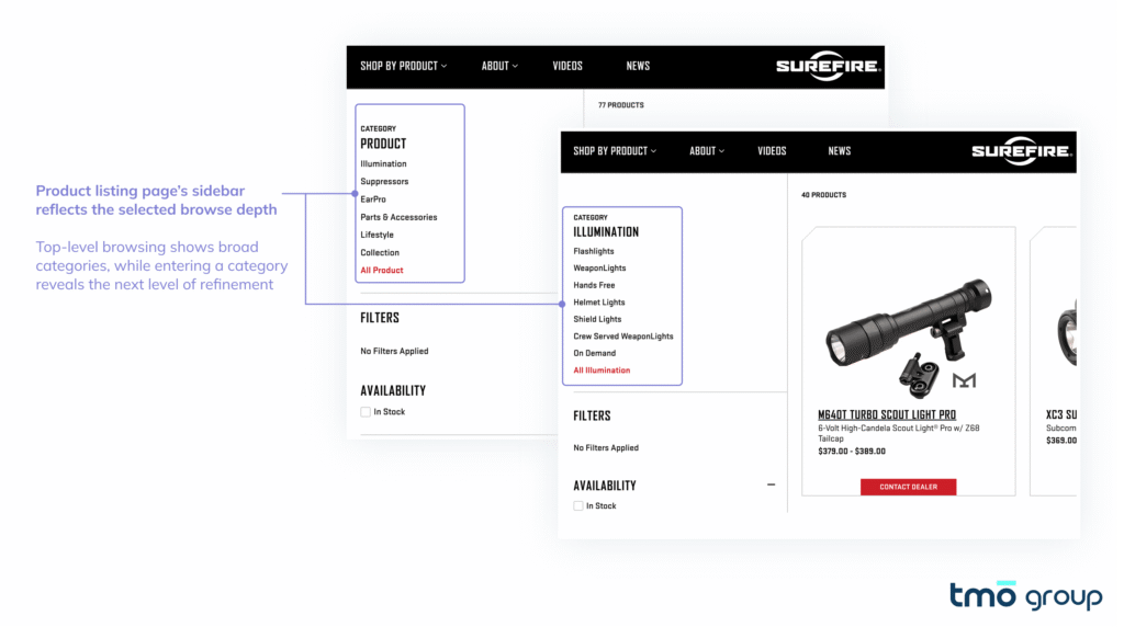
The brand we audited carries products across multiple subcategories: everyday carry flashlights, outdoor lanterns, weapon-mounted lights, and more. For existing customers, this taxonomy is intuitive. For a first-time visitor arriving through a paid ad, it's a barrier.
Audit data showed that the homepage and category listing pages generated a low share of product page views. The majority of PDP traffic came from direct landing, not from users navigating through these pages. The homepage and PLPs were not functioning as effective product discovery surfaces.
The problems concentrated in two areas:
First, category logic lacked clear hierarchy. Product types, use cases, functional features, brand series, and promotional entries all appeared at the same level. Users had to interpret the differences themselves rather than being guided through a clear structure into the right product range.
Second, filters were underutilized. Click data on the sidebar filter area was very low. This typically is because the current filter structure doesn't help users understand where to start narrowing down. For a lighting equipment category, high-impact dimensions like brightness range and intended use case should appear above series names in the filter hierarchy.
SureFire's navigation supports multiple discovery paths: broad category, subcategory, use case, and product line, and the sidebar filters on listing pages mirror the top navigation logic. Users who land on a category page can continue refining immediately, without having to re-orient themselves within a new taxonomy.
4. Trust Signals Are Misplaced
The brand had strong trust foundations, including a vibrant community, YouTube influencer endorsements, and industrial design awards. The problem was that these signals weren't where users needed them most.
Two specific issues surfaced in the audit:
Award presentation: The site featured significant award recognition on the homepage, but the awards were embedded in a rotating carousel that read more like general brand news than a clearly positioned third-party authority signal.
Key assurance content appeared too late. A module covering lifetime warranty, free shipping, 30-day returns, and 24/7 customer support is highly relevant for first-time buyers. But it appeared deep on the homepage scroll.
Practical adjustments worth considering:
- Move shipping, returns, and warranty guarantees to a position adjacent to the primary CTA, rather than below the page fold
- Present creator endorsements and platform ratings as standalone, visually distinct trust modules in high-visibility homepage areas
- Pair award and certification displays with a brief line of explanatory copy that helps users understand why the recognition matters
Nielsen research shows that 83% of consumers trust recommendations from independent third-party sources. The Influencer Marketing Factory's 2024 report found that 84% of consumers consider authentic user-generated content (UGC) highly useful in purchase decisions. For premium outdoor and equipment brands, this means endorsements from real users and independent reviewers consistently outperform brand self-description.
5. Mobile UX Fails to Convert Paid Traffic
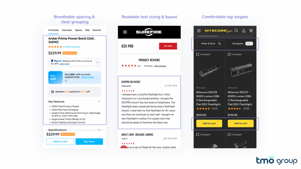
The client site's paid traffic was predominantly mobile. Yet add-to-cart conversion rates showed a meaningful gap between mobile and desktop. In practical terms: the same ad spend was producing significantly lower revenue per visitor on mobile.
The mobile issues we found weren't a single critical failure. They were an accumulation of small friction points:
| Issue | What to Check |
|---|---|
| High content density | Excessive content and interactive elements competing in limited above-the-fold space |
| Readability | Review text using small font sizes and tight line spacing, difficult to skim |
| Touch target size | Color selectors, quantity controls, and key interactive elements below the recommended 44×44px minimum |
| Navigation inconsistency | Mobile menu category structure differed from desktop, with inconsistent labeling |
Accessibility testing confirmed this pattern: the majority of interactive mobile elements assessed did not meet WCAG-recommended minimum touch target sizes, creating measurable usability risk.
The underlying cause is common across D2C brands: product pages are often designed desktop-first, with mobile treated as a scaled-down adaptation rather than a purpose-built experience. When paid traffic is primarily mobile, that design logic needs to reverse.
Brands like Arc'teryx have invested heavily in mobile content simplification and interaction design, with a clear operating principle: when your paid traffic arrives on phones, every mobile friction point is direct waste of your ad budget.
Apply for TMO Group's CRO Pilot Program
Premium sports and outdoor purchases are not impulse decisions. They are understanding-driven. Before a customer buys, they need to find the right product, interpret the specs, trust the brand, and have a clear path to purchase.
The five issues above share a common root: page content is organized around what the brand wants to show, not around the sequence in which users need information to make a decision. That gap is where conversion rate is lost.
TMO Group is currently offering a zero-cost CRO Audit for eligible D2C stores. You will receive:
- Conversion Barrier Analysis: Locate where and why visitors drop off.
- UX & Usability Assessment: Identify friction points in the user journey.
- Annotated Screenshots: Visual breakdowns of key issues with clear explanations.
- Prioritized Action Roadmap: A plan sorted by impact and effort.
- Quick-Win Recommendations: Immediately actionable improvements.
If you want to identify the biggest friction points across your key pages and turn them into prioritized actions, you can learn more and apply for the pilot here:

FAQ
Usually it comes down to gaps in product discovery, spec accessibility, trust placement, and mobile experience. High-AOV products are especially sensitive to these friction points.
Core value prop, key specs, clear pricing, and one dominant CTA. Multiple competing CTAs and promotional callouts in the same zone typically hurt conversion.
Most users never scroll that far. For spec-driven buyers, if they can't find the information they need quickly, they leave without converting.
PDP information hierarchy, earlier spec placement, navigation clarity, trust signal positioning, and mobile UX. These tend to move conversion more than increasing ad spend.
Where users drop off, what's creating friction in the purchase path, and which fixes will have the most impact, ranked by effort and return.
Consistent traffic with low add-to-cart rates, low PDP conversion, or a significant mobile-to-desktop conversion gap are the clear signals.