



Getting shoppers to a product page is only part of the conversion challenge. For comparison-heavy products like home appliances, the final decision often depends on whether users can quickly compare models, confirm technical requirements, and find enough reassurance to proceed.
Dimensions, power requirements, accessories, installation, warranties, and differences between models can all influence the decision. Specialty products such as coffee machines can require even closer evaluation, as buyers often have specific preferences around brewing methods, features, and daily use.
TMO Group recently audited the product-page experience of a home appliance D2C brand to understand where this friction occurs. In this article, we'll cover 5 common conversion barriers that can interrupt the path from active consideration to purchase, many of which are also relevant to other mid- and high-AOV durable goods brands.
TMO Group is currently recruiting eligible brands to join our eCommerce Conversion Rate Optimization (CRO) Pilot Program. We are offering zero-cost product page audits and actionable optimization recommendations.
1. Unclear Model Differentiation
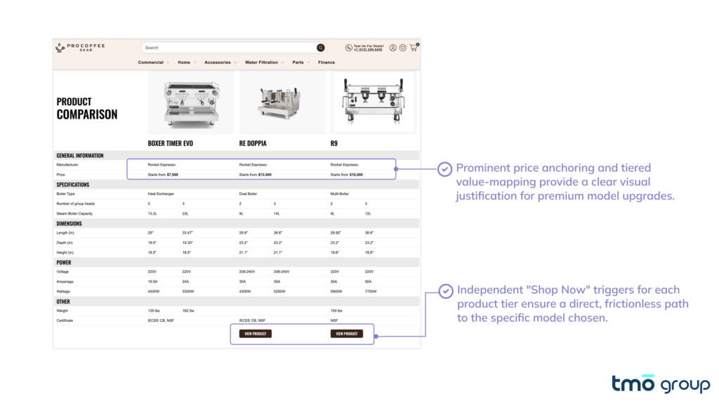
Most home appliance brands carry more than one product line, entry-level, mid-tier, flagship, spanning a wide price range. That should be an opportunity to lift order value, but only when shoppers can quickly understand what changes between models and why a higher price is justified.
Common warning signs include:
- Users bounce between product pages repeatedly, sometimes even after adding to cart.
- Customer service receiving frequent "what's the difference" questions.
- Layout and content that can't help narrow which model fits which user.
Appliance purchases are usually driven by functional fit. Shoppers need to understand not only how models differ, but which option best matches their needs. When the site leaves that interpretation to the user, the decision takes longer and comparison shifts to other tabs, competing sites, or customer support.
A well-designed product comparison table should highlight meaningful differences, connect features to use cases, and provide a clear call to action for each model. This reduces decision friction, supports trade-up to premium options, and still helps price-sensitive shoppers identify a suitable lower-tier alternative.
Premium coffee machine and kitchen appliance brands often use responsive HTML comparison tables rather than static images, with a direct “View Product” or “Shop Now” call to action for each model.
2. Fragmented Action Zone
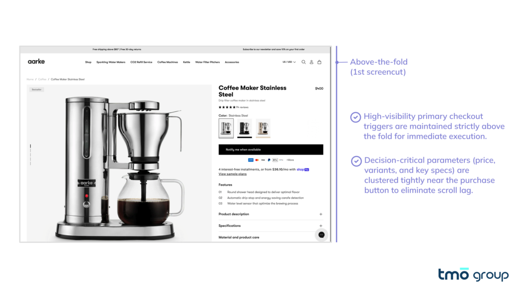
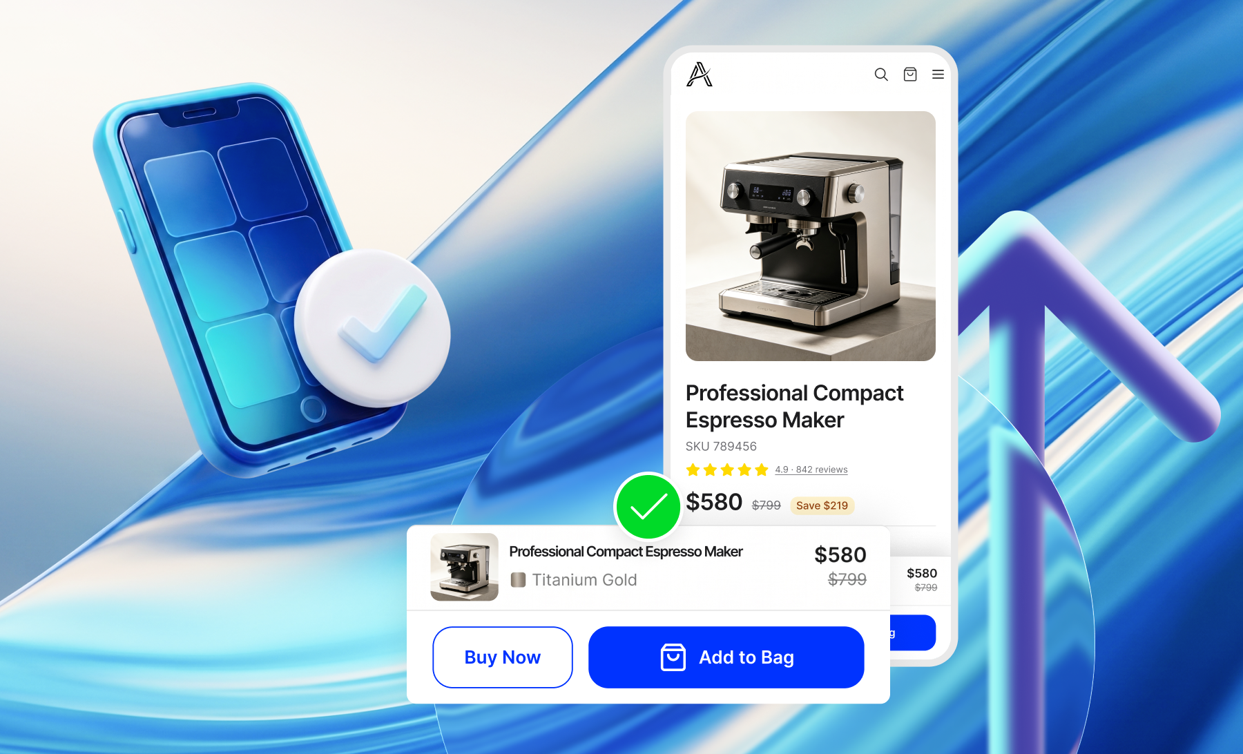
Also known as the buy box, the purchase area is where product evaluation turns into action. It typically includes the product title, price, availability, variant selectors, and add-to-cart button. These elements should appear as one clear, consolidated decision module.
In the audited experience, two issues created unnecessary friction:
- Fragmented information: Price, specifications, options, and purchase controls were distributed across the page, forcing shoppers to scroll and reconstruct the information needed to make a decision.
- Excessive vertical space: Repeated selectors and secondary content pushed the primary call to action too far below the initial viewport.
| Common Issue | Impact on Conversion |
|---|---|
| Add-to-cart button requires extensive scrolling | Shoppers cannot act at the moment of decision |
| Variant selectors are unintuitive and vague | Price and other decision-critical information are pushed down |
| Sticky purchase bar redirects to another page | Breaks the expected add-to-cart interaction |
| Sticky bar omits an available “Buy Now” option | Removes the shortest route to checkout |
This is particularly costly for home appliances, where shoppers often need to verify several details before committing. Once those questions are resolved, the primary purchase action should be immediately available. If shoppers must search for it or scroll back through the page, the site introduces friction at the point of highest purchase confidence.
Aarke keeps the price, product options, and primary purchase button within the same initial viewport, minimizing the distance between evaluation and action.
3. Key Specifications Are Hard to Find
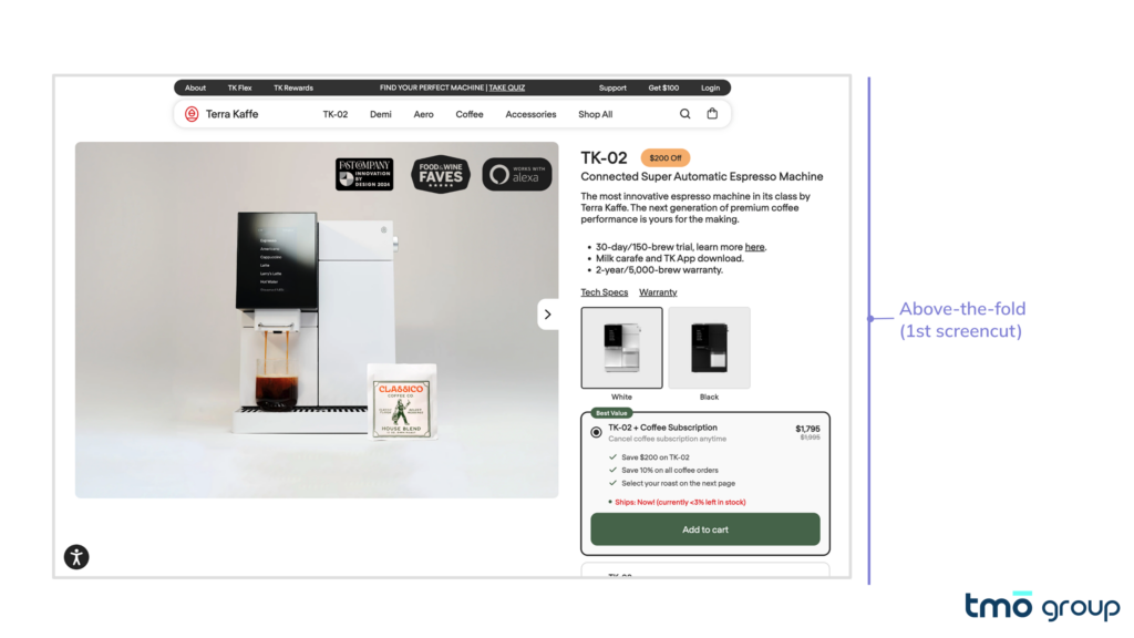
Typically, the issue is not whether specifications, manuals, and supporting documentation exist, but whether shoppers can find the information they need at the point of decision. Examples include technical details being buried under collapsible sections, positioned far below the action zone, or separated into external documents.
In this project, analysis of FAQ traffic and customer support logs revealed a clear mismatch when compared with product-page engagement data:
- FAQ content covering specifications and compatibility attracted substantial traffic, while the same topics appeared frequently in support conversations.
- Engagement with equivalent information on the product page remained low.
- Session behavior indicated that shoppers were leaving the product page or navigating elsewhere to confirm details that should have been readily accessible.
Users don't scroll far enough to find it, and leave assuming the site doesn't have the answer. For appliances, where specs are key drivers for the decision, every one of those detours risks being a lost sale.
Terra Kaffe places core specs link right next to the buy button, so users never need to leave the purchase flow.
4. Mobile Friction
For higher-value appliances, mobile shoppers often need to review several details before committing. Small usability issues can therefore compound quickly, turning minor inconvenience into abandonment.
| Issue | What we observed |
|---|---|
| Bounce and exit | Mobile users dropped off more frequently than desktop users at key stages |
| Layout overlap | Sticky elements and floating components obscured content or increased the risk of mis-taps |
| Slow initial load | Decision-critical information and purchase controls took longer to become usable |
| Interaction friction | Pop-ups, selectors, and floating labels added steps instead of simplifying the journey |
Because mobile often represents a substantial share of acquisition traffic, particularly from paid campaigns, these issues can have a larger revenue impact than expected. They rarely stem from one major defect. More often, several small friction points accumulate across the page.
Device-level funnel comparisons can reveal where mobile performance diverges from desktop, while session recordings help explain the underlying behavior, including repeated taps, interrupted scrolling, obscured content, and difficulty reaching the primary action.
5. Misplaced Trust Signals
Trust signals play different roles across an eCommerce site. Brand heritage, CSR initiatives, and company credentials can build general credibility on corporate or brand pages. However, shoppers evaluating a specific product also need reassurance that directly supports the purchase decision.
In this audit, relevant proof was available, but it was often separated from the product page, positioned far from the action zone, or hidden behind additional interactions. This limited its ability to influence shoppers at the moment it mattered most.
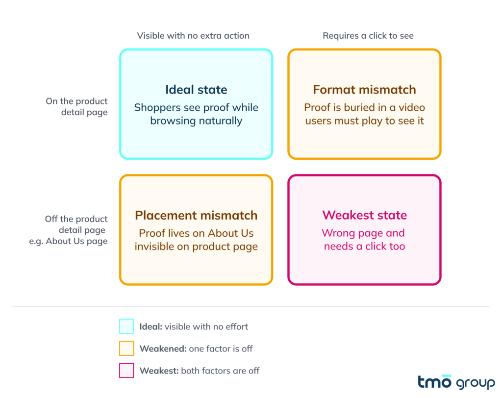
Decision-stage trust signals may include:
- Product proof: certifications, test results, awards, expert endorsements, and evidence of performance
- Customer validation: ratings, reviews, testimonials, and user-generated content
- Transactional reassurance: warranty coverage, returns, delivery information, secure payment, and after-sales support
Their effectiveness depends on two factors:
- Relevance: Does the signal address a concern associated with this product or purchase?
- Visibility: Can the shopper see and understand it without interrupting the decision journey?
This does not mean every credential needs to be placed beside the purchase button. The product page should surface concise, decision-relevant reassurance, while linking to more detailed information elsewhere when needed.
Surface the most relevant product proof and transactional reassurance near the action zone, while retaining broader brand and corporate trust content elsewhere in the site.
Apply for TMO Group's CRO Pilot Program
All five issues share one thing: they happen after purchase intent is already there. The problem is a specific gap between "interested" and "checked out." A real conversion audit shouldn't stop at how a page looks, it should diagnose revenue loss against actual user behavior data.
TMO Group is currently offering a zero-cost CRO Audit for eligible D2C stores. You will receive:
- Conversion Barrier Analysis: Locate where and why visitors drop off.
- UX & Usability Assessment: Identify friction points in the user journey.
- Annotated Screenshots: Visual breakdowns of key issues with clear explanations.
- Prioritized Action Roadmap: A plan sorted by impact and effort.
- Quick-Win Recommendations: Immediately actionable improvements.

FAQ
Unclear model differentiation, an inefficient Buy-Box, buried specs, mobile friction, and misplaced trust signals.
Shoppers compare models to find the right fit. Without clear guidance on which model suits which user, they research it themselves, and often leave before deciding.
The section of a product page holding price, stock status, and the buy button, the core area for the final purchase decision. Scattered info or a hard-to-find button directly hurts conversion.
Users expect certifications and credentials on the decision page, not elsewhere. If they're not visible, they don't build purchase confidence.
Mid-to-high AOV brands with longer decision cycles: home appliances, consumer electronics, furniture and more.
A free conversion audit, UX evaluation, annotated screenshots, a prioritized roadmap, and quick-win recommendations.