

Many established D2C brands have already built reliable traffic acquisition engines, with paid media, SEO, content, and social channels delivering a consistent flow of visitors. Yet, when traffic metrics are set alongside revenue figures, underperformance is often difficult to attribute to a single cause: visitors browse without adding to cart; add-to-cart rates appear reasonable but checkout completion lags; checkouts are initiated but transactions don't follow through.
Industry data suggests this pattern is widespread. According to IRP Commerce, the global average e-commerce conversion rate stood at just 1.56% as of February 2026. For many brands, the instinct is to respond by increasing traffic investment. However, as we've explored in previous articles, persistently low conversion rates tend to reflect systemic friction distributed across multiple stages of a user's journey.

This article examines each stage of the D2C conversion funnel, identifies where friction most commonly occurs, and makes the case for a full-funnel diagnostic approach over fragmented optimization.
As part of our Conversion Optimization Program, TMO is selecting a limited number of D2C brands for a zero-cost diagnostic audit and optimization roadmap.
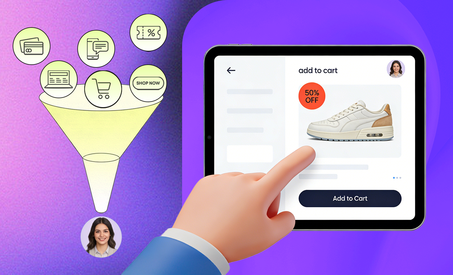
What is a D2C conversion funnel?
In e-commerce, a conversion funnel is the sequence of user actions that leads from first visit to completed purchase. In analytics terms, that journey is typically measured through milestones such as session start or landing, product view, add to cart, checkout initiation, shipping and payment submission, and purchase. Friction at any point reduces the yield of the steps that follow.
In practice, those moments are shaped by what users encounter across distinct sections of the site. For diagnostic purposes, this article examines the funnel through the pages and touch points where drop-off typically occurs: entry pages, navigation, Product Listing Pages (PLPs), Product Detail Pages (PDPs), cart, and checkout. This lens helps identify where behavioral friction is actually being created across the purchase journey.
1. Homepage & Traffic Entry
D2C site visitors are not a homogeneous group. Even when entering through the same page, their intent can vary considerably. Drawing on UX research principles, visitors to a D2C homepage can generally be grouped into three intent types:
| User Type | Behavior | Core Need | Drop-off Risk |
| Goal-directed | Arrives with a specific product in mind; navigates directly via search or menu | Fast, low-friction path to the target product | Exits immediately if search results are inaccurate or absent |
| Exploratory | Browsing without a defined objective; relies on visual cues and featured content | Drawn in by bestsellers, new arrivals, or trending categories | Leaves without action if the homepage fails to guide them forward |
| Evaluative | First encounter with the brand; assessing whether it merits further engagement | Quick read on brand credibility and professionalism | Bounces if the value proposition is unclear or unconvincing |
A homepage that does not account for all three intent types will generate unnecessary drop-off at the very top of the funnel.
Entry points are more dispersed than they appear
For brands running paid media and content marketing, the homepage is frequently not where visitors actually land. Campaign landing pages, PDPs, and promotional pages each function as entry points with their own conversion responsibilities. Optimizing the homepage while overlooking these high-traffic pages means meaningful leakage is occurring at first contact, losses that typically surface in analytics as little more than an elevated bounce rate.
2. Navigation & Category Exploration
Navigation structure is one of the most consistently underdiagnosed sources of conversion loss on D2C sites. Unlike checkout abandonment, which is measurable and relatively visible, navigation friction produces gradual, diffuse drop-off that is difficult to trace back to its structural cause. The symptoms appear as high category page bounce rates or below-benchmark add-to-cart figures, while the underlying problem goes unidentified.
From a conversion funnel perspective, navigation is the skeleton of the entire purchase journey. When the path carries ambiguity or imposes unnecessary steps, downstream optimization loses much of its value: users simply don't reach those pages. Common navigation friction points:
| Friction Type | How It Appears | Conversion Impact |
| Information Architecture (IA) misaligned with user mental models | Category structure reflects internal business logic rather than how users search | Users cannot intuitively locate their target category; bounce rate rises |
| Promotions displacing core navigation | Campaign pages dominate primary menu entries, obscuring standard purchase paths | High-intent users cannot find their entry point |
| Excessive menu depth | Users must click through multiple levels to reach a target page | Patience is exhausted before product pages are reached |
3. Product Pages: PDP & PLP
The Product Detail Page is where visitors make the transition from interest to add-to-cart action. It is also the most functionally complex page in the funnel, required to simultaneously communicate product value, build purchase confidence, address objections, and prompt a decision.
Too much information increases cognitive load; too little fails to support the purchase decision, particularly for higher-ticket products. Calibrating this balance effectively requires grounding in actual user behavioral data and an objective UX evaluation: internal assumptions and accumulated convention are rarely sufficient on their own.
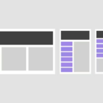
The PLP: an underestimated conversion stage
Product Listing Pages determine how many visitors actually reach a PDP. How users filter, compare, pause, and disengage on a category page directly sets the ceiling for everything downstream.
| PLP Dimension | Underperforming State | High-Performing State |
| Filter options | Based on inventory structure or internal categories | Based on how users actually make purchase decisions |
| Product card information | Image and name only | Price, key attributes, ratings, stock status |
| Default sort order | Listed by date added | Sorted by relevance, sales volume, or rating |
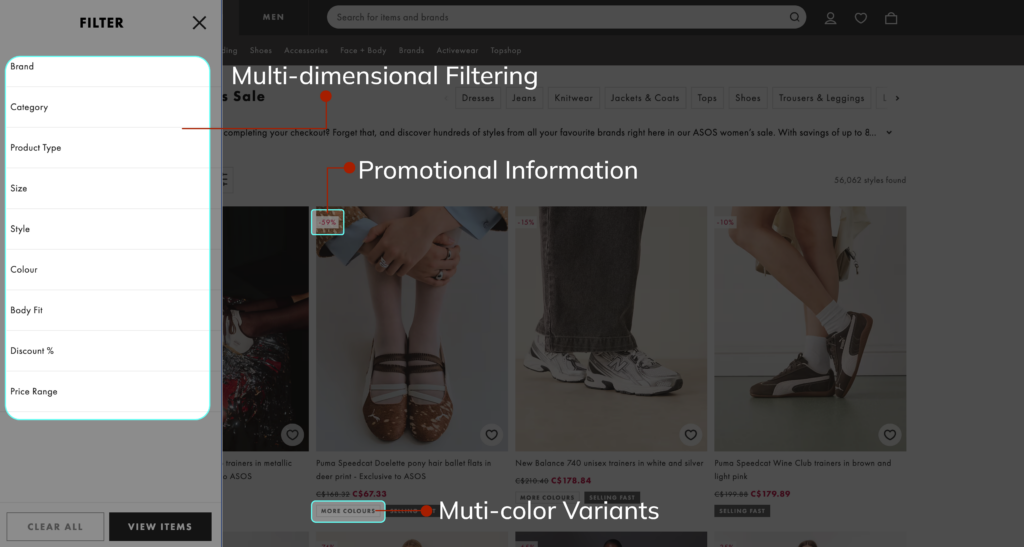
Case Example:
ASOS has continuously refined its PLP filtering system, introducing multi-dimensional options including style, color, fit, and size with promotional flags and color variant previews directly on product cards. Users are able to gather sufficient comparison information without leaving the listing page, measurably shortening the path to the PDP.
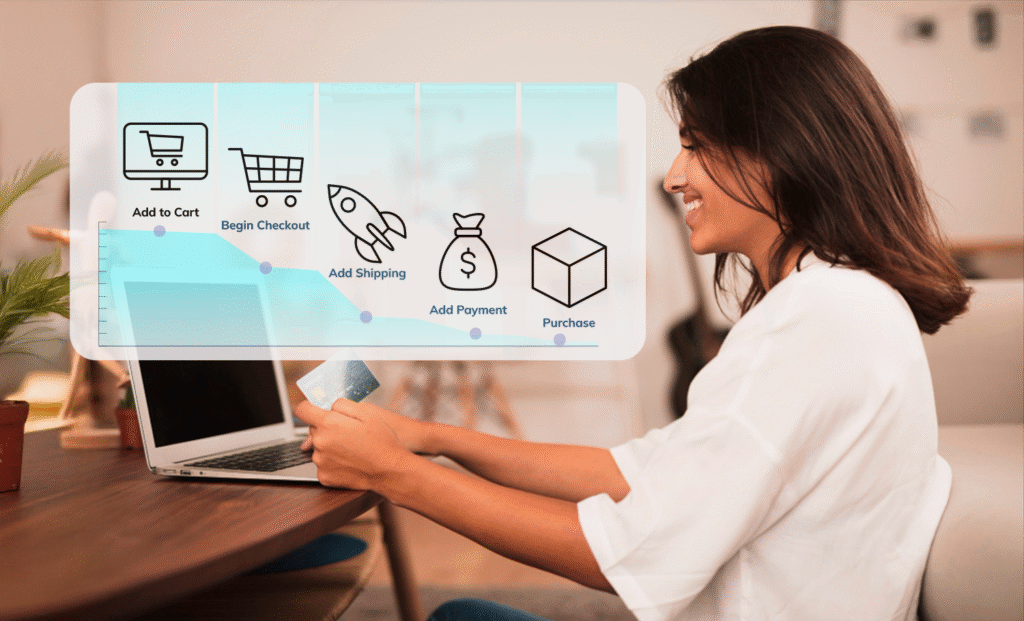
4. Cart & Checkout
By the time a visitor reaches the cart, they have already completed the most demanding part of the journey: finding the product, evaluating it, and forming an intent to purchase. This is the highest-intent stage of the funnel, and correspondingly the stage where losing a user carries the greatest cost.
According to Baymard Institute research (2025), the leading reasons users abandon during checkout include:
| Reason | Share of Abandonment |
| I was browsing / not ready to buy | 43% |
| Extra costs too high (shipping, etc.) | 39% |
| Delivery was too slow | 21% |
| I didn't trust the site with my credit card | 19% |
| Had to create an account | 19% |
| Too long/complex checkout process | 18% |
| Return policy wasn't satisfactory | 15% |
| Website had errors/crashed | 15% |
| I couldn't see total order cost upfront | 14% |
| Not enough payment methods | 10% |
The data points to an important conclusion: the majority of checkout abandonment is not driven by a genuine change in purchase intent, but by process friction that brands have the ability to identify and address.
The cart as a final confidence checkpoint
The cart page is where users make their last value assessment before committing to checkout. When cart information lacks clarity, policy reassurances are absent, or the page introduces distracting elements, users who were close to completing a purchase may choose to defer, often permanently.
Mobile checkout as a compounding friction point
Over 70% of e-commerce traffic arrives via mobile, meaning the majority of checkout attempts occur on mobile devices. Yet the mobile checkout experience is typically the most under-adapted part of the purchase journey. Form usability, payment flow, and CTA accessibility on smaller screens all influence whether a transaction completes. For most sites, this remains an area of material, addressable leakage.
5. Trust & Credibility
Trust is an ongoing evaluation that users conduct at every stage of the funnel. From the first impression on the homepage to the payment screen at checkout, users are continuously assessing: Is this brand credible? Does this product deliver what it claims? Is my data handled responsibly?
| Site Section | User's Core Trust Question | Effective Trust Signals |
| Homepage | Is this a legitimate, established brand? | Brand credentials, press coverage, partner endorsements |
| PDP | Does this product actually perform as described? | User reviews, ingredient or material transparency, third-party certifications |
| Cart | Is my order protected if something goes wrong? | Returns policy reminder, secure payment badges |
| Checkout | Is my payment information safe? | SSL indicators, recognized payment methods, security certifications |
| About page | Is there a credible organization behind this site? | Founder background, brand values, sourcing or production standards |
A trust gap at any single stage can create compounding hesitation. It won't necessarily trigger an immediate exit, but surfaces as drop-off further down the funnel. About pages, policy pages, and FAQs serve as deep trust anchors: they don't drive add-to-cart directly, but they determine whether a hesitant user decides the brand warrants their confidence.

Why a Full-Funnel View Leads to Better CRO Decisions
Understanding the conversion funnel as a whole makes it easier to see how users move through the site, where progress slows, and where drop-off begins to compound. Looking at these stages together helps surface not just isolated symptoms, but the underlying points of friction that deserve attention first.
| Site Section | Core Conversion Task | Typical Drop-off Signal |
| Homepage & entry | Retain visitor; surface a relevant next step | High bounce rate, short average session duration |
| Navigation | Enable the user to locate their target product | High category page bounce, low add-to-cart rate |
| PLP & PDP | Convert interest into add-to-cart action | Low PDP scroll depth, add-to-cart below benchmark |
| Cart | Consolidate purchase intent | High cart abandonment, low checkout initiation |
| Checkout | Complete the transaction | Step-by-step drop-off through checkout flow |
| Trust | Sustain confidence throughout the journey | Anomalously low conversion on high-traffic pages |
This full-picture view also makes prioritization more practical. Instead of optimizing pages in isolation, teams can identify which issues are most likely to affect revenue, which problems are structural rather than local, and where limited optimization effort is likely to produce the strongest return.
A professional full-funnel CRO audit translates these questions from informed speculation into evidence-based conclusions:
- Identification of high-value drop-off points that internal optimization has not reached
- A prioritized optimization roadmap ranked by estimated revenue impact
- A measurable conversion baseline against which future improvements can be tracked
- Data-backed direction for site redesigns, reducing the risk associated with large-scale changes
Working With TMO: A Systematic View of Your Conversion Funnel
For most D2C brands with established traffic, there is typically more conversion potential within the existing visitor base than additional traffic investment alone can unlock. Systemic friction distributed across multiple funnel stages rather than concentrated in one visible problem area is a common reason revenue underperforms relative to traffic volume.
TMO's Website CRO (Conversion Rate Optimization)Audit provides a structured, evidence-based assessment of the complete conversion path from traffic entry to completed purchase. We identify friction at each stage, map the full customer journey, and deliver a prioritized optimization roadmap so your team has clear direction on where to focus for the highest revenue impact.
Get in touch with our CRO team to discuss your site's conversion challenges and explore which audit package is the right fit.
FAQ
A Landing Page CRO Audit focuses on specific high-traffic pages: campaign landing pages, paid traffic entry points, key PDPs, and is well-suited to brands that need targeted improvements with measurable short-term impact. A Website CRO Audit covers the entire customer journey from entry to checkout, and is the appropriate choice when conversion issues are distributed across multiple funnel stages and internal optimization has reached its limits.
Internal optimization efforts typically operate within existing data views and established team assumptions, which can make it difficult to identify structural issues that fall outside the current frame of reference. A professional audit introduces an external, full-journey perspective that surfaces high-value drop-off points internal teams consistently overlook.
TMO Group's audit delivers a diagnostic report and a prioritized optimization roadmap. Implementation can be executed by your internal team or supported through TMO's follow-on services. All recommendations are developed with practical executability in mind.
Brands that tend to see the strongest return share several characteristics: an established and stable traffic base; multiple rounds of internal optimization with limited overall conversion improvement; difficulty attributing conversion underperformance to a specific funnel stage; or a planned site redesign where data-backed direction would meaningfully reduce execution risk.