
Imagine a customer landing on your eCommerce website. First impression is quite good – interesting, but not outlanding design, beautifully picked colors, enticing images. It gets better as the customer continues. The navigation quickly takes them to exactly the page they need. Product images show exactly the qualities that the customer likes without the aftertaste of being manipulated. Description is spot on: this is exactly what they need to learn to confirm this is what they are looking for. Q and A section blows away the thin veil of doubt if there ever was one. Mouse hovers over the “Order now” button for just a split second before the product is placed in the cart. All that is left is to make a payment…
This is where things are starting to go wrong. The customer is redirected to another website, where they are met by a long signup form with a bunch of mandatory fields. Even after powering through those obstacles, there is only one payment method available – and what do you know, not the one our customer would prefer to use. The magical carriage of a wonderful shopping experience melts away, revealing the ugly pumpkin of bad checkout design it really was. Customer leaves, annoyed, never to be seen again.
If this cautionary tale, though a little exaggerated, scares you – good. You should be scared of having a bad checkout experience on your eCommerce website. If you're serious about making it easier for your customers to pay and increasing sales for your business, you need to have full control over the entire checkout process and you need to set it up right.
Here are 9 tips that will help you:
1. Multiple Payment Methods
It is difficult to believe, but there are still websites that offer one and only one payment method. This is how bad for user experience it is: there are a few studies showing that from 50 to 80 percent of customers would prefer to see the variety of payment methods on the website and are likely to leave if it is not the case.
Although It's not necessary – nor it is feasible for that matter – to offer every conceivable payment method available, you still want to take a look at your target audience to see which payment methods they use, and aim to capture the majority of options.
If your website allows direct bank transfers and payments from all major credit cards and payment systems – that’s a good start. Actual set will largely depend on your targeted demographics, locale, and nature of the product.
Another great news is that these days most eCommerce platforms come with a variety of payment options already available, and your job is to tick those you want to enable.
2. Payment without creating an Account
How many usernames and passwords do you need to remember? Do you really need another one? I doubt it. Why would anyone want to put up a wall like that preventing people from paying. Forcing people to create a new account is too intrusive for most customers, and it's a major conversion killer.
Even if the process is as simple as a “Sign up with Google” button, it does not solve the underlying problem. A study by Smashing Magazine found that the main reason users hate setting up an account is they expect to be flooded with promotional emails. Besides, many customers just don't understand why they need to sign up to buy a product when brick and mortar stores don't require an account to buy from them.
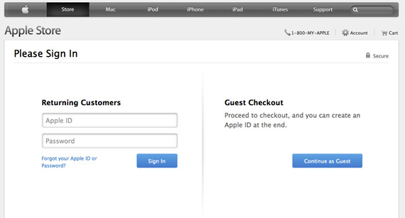
If signing up indeed provides customers a treasure trove of value, keep it, but make it optional. Follow Apple's lead and provide a “Guest Checkout” option.
3. Don't Redirect Customers
You worked so hard to get people to your website. Why would you send them away to another website to pay?
A case can be made for huge and trusted payment service providers – it can be a little more comforting to enter your credit card information when the name in the URL string is a well-known service.
But generally, redirects are obstacles in the way of smooth transactions and have to be avoided when possible.
4. Seamless Checkout Design
Even having a different design in your checkout area can be a huge psychological barrier for customers. Imagine an offline store – wouldn’t you feel a little uneasy if you discovered that the cashier's desk dons different colors and the employee there wears a different uniform? Am I in the right place? It is not a scam, is it?
Sure, certain online payment providers deliver a ready-made frontend module for you, but the price you end up paying is losing the control over the look and feel of your checkout page.
There are payment solutions that totally understand this problem and include customization options (logo, colors, font). Make sure you use it to the fullest.
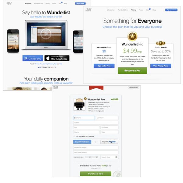
Example of customizing the checkout page to match the design of the rest of the website.
5. Make it Easy to Fix Errors
When ancient people said “to err is human”, they most certainly didn’t mean website interfaces. Yet, it is one of the key things to keep in mind in UI/UX design in general and in checkout design in particular.
A zip code can get overlooked or the user forgets the "@" in their email address – if something can go wrong, at some point it will. Your task is to calmly point out the error and give users the opportunity to correct it.
Make sure your workflow allows mistakes to be easily fixed in a clear and obvious way. If a checkout page displays an error message at the top of the page, and the customer is deep down next to the submit button, it will take extra time and effort for them to figure out why they are stuck. Make sure at all times they know what is going on.
And, of course, save the information they submit: it is supremely annoying having to retype everything again just because you made one silly mistake. This is particularly true for longer forms, but make sure you do it for short forms too – even a little annoyance works against you.
6. Ask Only for Essential Information
Few things kill conversion more than having to fill out a form with information that's not necessary for making a purchase. Your checkout is not the 400m hurdles; it's a sprint where you want users to run to the finish line as quickly and smoothly as their legs can carry them.
A report published by Forrester found that 11 percent of users abandoned an online purchase because the site was asking for too much information.
If you absolutely need to have those fields, make sure you have explained why you need his information. Better, make it optional. Better still, move it to the thank you page and leave it to the customer to decide if they really want to share their information with you.
7. Pay Attention to Security
Last few years taught everybody that few things are as important as safeguarding personal information. Legislation like GDPR and PIPL, encrypted protocols, abundance of other security measures – they all are there to make sure personal information does not fall into the wrong hands.
While everybody is entitled to their own personal opinion how much of that is theater (cough – cookie consent – cough), online security is particularly important when it comes to eCommerce.
Always go out of your way to implement best security practices and to showcase the security measures to the customers – payment security concerns are still a popular reason for customer dropout.
Having a SSL certificate on your website and not redirecting people to a lesser known third party checkout page could be a good start, but you need to do more to reassure your customers that their data is safe.
You'll probably want to comply with the standards of the PCI Security Standards Council (PCI SSC). PCI compliance is enforced by payment card companies, and the council itself manages the security standards for anyone who stores, transmits, or processes cardholder data.
Be sure to display your security credentials with SSL, PCI, 3D secure, and other relevant security badges at your checkout area.
8. Minimize Distractions
The goldfish metaphor for poor attention span is not a good one. First, contrary to popular belief, goldfish can remember things far beyond what happened three seconds ago – up to a few months. Second, and more importantly - humans are not fish!
What was I talking about…?
Right, the distraction. And how we, humans of the digital era, can barely concentrate on one important thing without opening a few new tabs to look at next ones.
Having this in mind, mercilessly remove everything from the checkout area. There is a time and place for telling a customer about other exciting things you can offer, but it sure isn’t when their mouse pointer is hovering above the “Make a payment” button.
 Your sole objective is to see people through to making the final payment. If it means removing the header, the footer, the sidebar and all other irrelevant elements of the website – it is the sacrifice you should be willing to make.
9. Clearly show the next step
The main principle of a good UX is simple: the user should always be clear on two things: what just happened and what can I do next. This is especially true when you are in the checkout page of the website.
At every stage the next step should be crystal clear: be it a "Continue to checkout" button when an item has been placed in the cart, “Fill payment details” to enter the user’s data, or “Pay now” when everything is ready for the final step. The button should be clearly visible, its meaning – absolutely obvious, it should not compete for attention or be ambiguous in any way.
In conclusion, a few general notes. A lot of eCommerce businesses tend to concentrate on the catalog, assets, marketing – all very important things, no doubt. Checkout is often an afterthought – something we get out of the box, slap to the end of the funnel and call it a day.
Nothing can be potentially dangerous to your conversion rate that bad checkout experience. Make sure you are fully aware of it and check your current workflow against suggestions listed in our article.
Secondly, few businesses are alike, so don’t take at the face value any advice, including ours. Test it first. Of course, not all platforms are friendly to proper AB-tests of checkout workflow – try to do your best to measure the impact of changes you are making.
With that, allow us to wish your business success. Don’t hesitate to drop us a line through the Contact Us page to discuss how we can start writing that success story together.