

If you are looking for some new trends of website design, there is no doubt that the layout and structure are changing unpredictable. In fact, the new standard is nothing. In this article we'll talk about some interesting website layouts, which can inspire your web design.
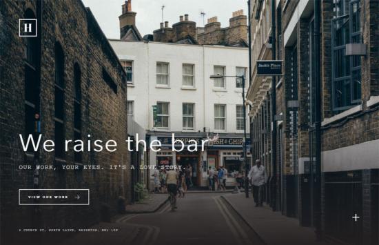
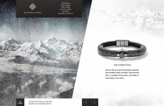
Split screen
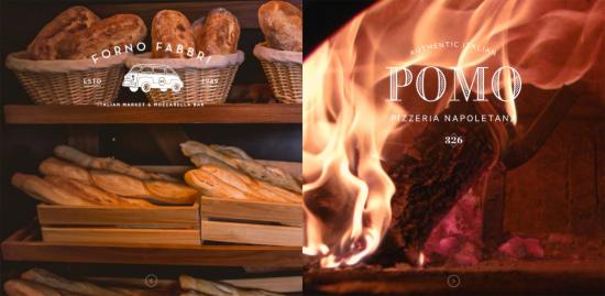
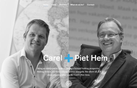
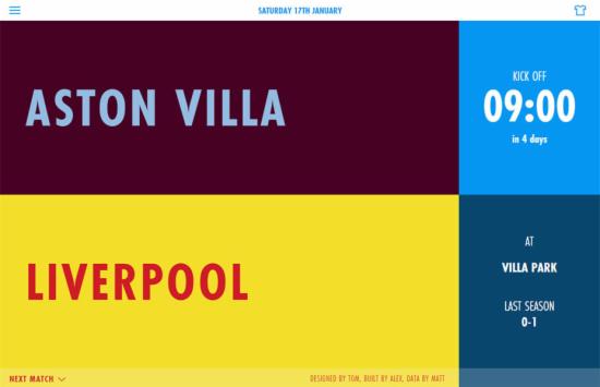
Some websites use some vertical lines to cut the whole screen into two parts. Why they choose this kind of design could be the following two reasons:
- In the whole design, there are two equally important elements. Generally we usually sort contents according to the importance. But if we want to promote two different things, this kind of design will show up all of them. Then users can select anyone to read quickly.
- Sometimes you'd like to show two different sides of an importance. For example, both core competencies and advantages of staffs could be shown by using a vertical line.
Minimalism
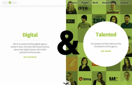
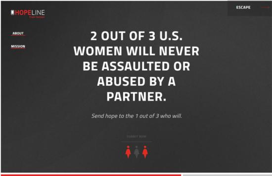
One of the most important things in web design is container. Box, border and all types of containers are used to divide the screen. But now, some websites break this rule. They get rid of these elements and stay on the path to minimalism.
Even some web pages get rid of the header and footer. They look like Grocery stalls with random order from left to right. They usually use some awesome product images instead.
We can find that after we remove the header and footer, the content stand out obviously. At first you'll see the company name, and then the key business is shown. They are not focus on brands at the beginning.
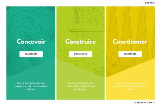
Module or grid
Following designs are based on module or grid. Each module are optimized to the screen. It looks like building blocks. In that case, people can add or delete content according to requirements and it won't break the whole design. But we need to know that if all the size of modules are same, it will be hard to emphasize things.
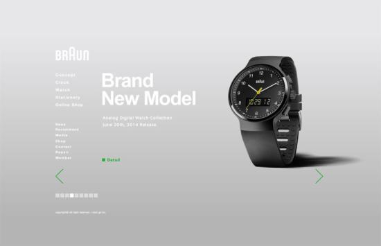
Within a screen
Finally, there are some websites that show everything within a screen. It is a branch of responsive web design. There is no scroll bar and designers must clearly establish the hierarchy of content. To be honest, this type of design is refreshing.


