
The Home & Furniture category is one of the lowest-converting sectors in eCommerce at an average conversion rate of just 1.41% and cart abandonment rates nearing 79%. This comes as no surprise, since rarely anyone buys a sofa on a whim:
Consumers need to measure their space, read reviews, compare prices across multiple sites, and sometimes even visit a physical showroom.
The case is similar with other products like in Smart Home: the more technical a product is, the more information a consumer must process before making a purchase, and D2C sites need to provide sufficient support for this long and complex decision cycles.
In this article, we explore the 6 most common conversion leakage areas for info-heavy industries like Furniture and Smart Home, and break down the steps to address them and improve your conversion rates.
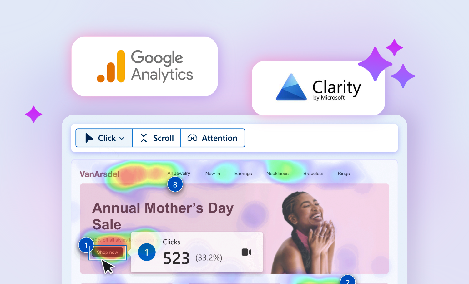
As part of our Conversion Optimization Program, TMO is selecting a limited number of D2C brands for a zero-cost diagnostic audit and optimization roadmap.
1. Product Pages Fail to Convey Critical Information
Furniture eCommerce faces one unique challenge: products are large, expensive, and highly visual. So, before buying, consumers must confirm that the size, material, and style will fit their specific environment.
While these needs are easily met in a physical store, online retailers must overcome sensory limitations and convey scale, textures, and how the item looks in a real room. When conducting Conversion Rate audits for clients in these industries, these are product information gaps we most often find:
- Dimensions are present but hard to access or visualize: When key information (like detailed measurements) is buried at the bottom of the page or hidden in collapsed tabs instead of readily available at the critical moment of decision-making, consumers need to intuitively judge or reassess if a table will fit their dining room. Furthermore, if these specifications are not complemented with visuals that provide spatial context or reference objects, shoppers might still hesitate.
- Material representation relies too much on text: Descriptions like "solid wood frame" or "premium fabric" cannot replace the tactile intuition a consumer uses in person. High-resolution detail shots showing wood grain, fabric weaves, or leather luster are essential conversion drivers.
- Lack of lifestyle photography: Lifestyle shots are about more than just aesthetics. They answer the consumer’s core question: "How will this look in my home?" When consumers can visualize the product in their own space, the probability of adding to cart increases significantly.
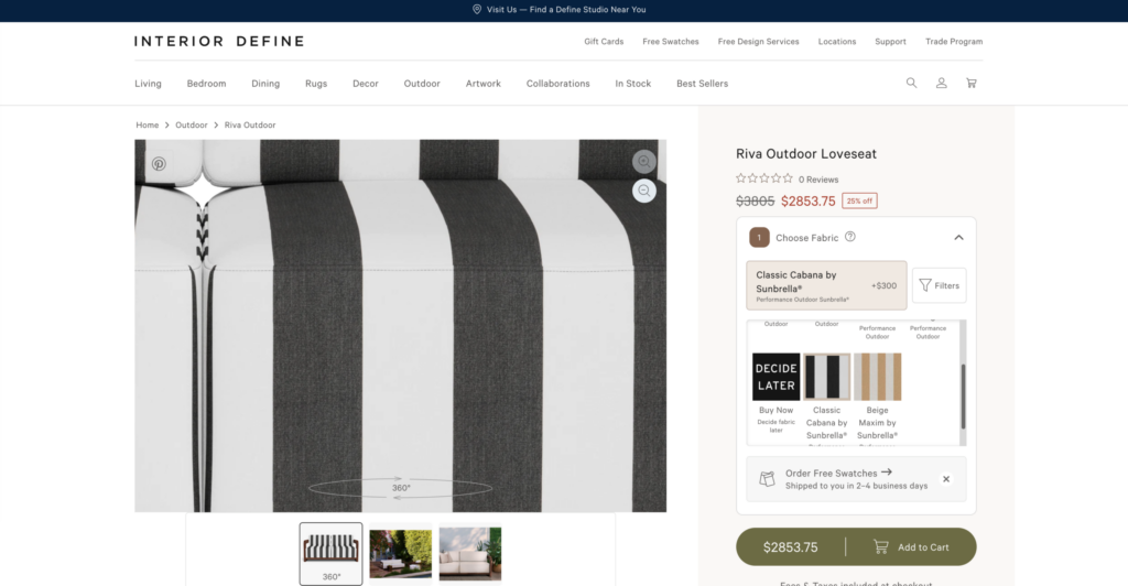
Best Practice: Interior Define offers a 360° viewer with 4K high-definition zoom. This allows consumers to swap fabrics, view the product from every angle, and inspect fabric textures and stitching details up close.
2. Poorly Timed Calls to Action (CTA)
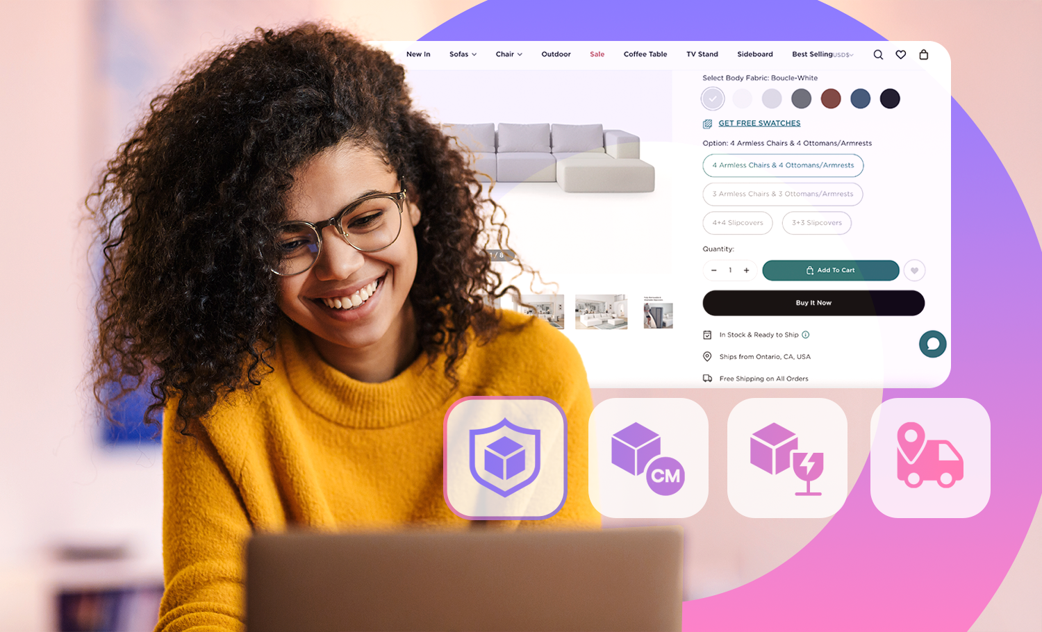
A "Buy Now" or "Add to Cart" button at the top-of-page's buying box is a must have in every Product Page. However, for a high-ticket item like a $2,000 sofa, it is unlikely the consumer has built sufficient confidence to proceed to purchase straight away.
A well-designed furniture page should act like an experienced salesperson: let the consumer browse and feel the product first, then provide clear guidance once intent has formed. Conversely, if the CTA appears too late on a content-heavy page, the friction of scrolling back to the top can break the decision flow. This friction manifests in several ways:
- No clear exploration path on the first fold: New visitors are often lost if there is no visual guidance on whether to look at details, materials, or specifications first.
- Lack of anchor or floating CTAs: For long product pages, only having a button at the top forces users to scroll back up to purchase. Implementing secondary CTAs at key decision points (e.g., after material descriptions or next to reviews) or using a "sticky" CTA is a direct way to reduce friction.
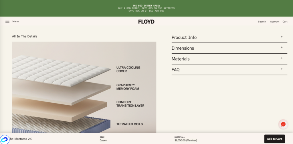
Best Practice: Furniture brand Floyd utilizes a floating "Add to Cart" button on its product pages to maintain a constant but non-intrusive path to purchase. A good tip is not only to provide an always-on button, but to accompany it with key decision-support elements like product name, picture, reviews, and cost (including discount).
3. Insufficient Content to Support Long Decision Cycles
Furniture purchases involve a complex mix of style, function, logistics, and budget. Consumers may spend days or weeks researching before deciding. D2C sites must provide content that supports this entire journey.
Most sites focus only on the "final decision" stage, neglecting those still in the "research and comparison" phase. Examples of essential content types that are often missing include:
- Sizing and buying guides: "How to choose a sofa size based on room dimensions"
- Material care instructions: "How to maintain oak surfaces" or "is this rug compatible with underfloor heating?"
- Styling and pairing advice: "Which lighting styles pair best with this minimalist dining table?"
- User-generated content (UGC) in real environments: Authentic photos from real homes help build trust and answer questions that professional studio shots cannot.
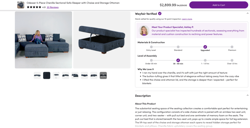
Best Practice: Wayfair includes "Expert Reviews" on product pages that describe the hand-feel of fabrics and the depth of storage space rather than just listing parameters. They also clearly label assembly time (30–60 min) and material tiers to help users understand the cost of ownership.
4. Smart Home: Technical Specs Fail to Show Value
The conversion challenges for Smart Home products such as smart speakers, lighting systems, or locks differ from traditional appliances or electronics. Consumers aren't just asking "does it look good?" but "How will this change my life, and is that change worth the price?".
For such products, avoid making the mistake of simply uploading a product manual to the page:
- Functional parameters without "translation": Technical specs like Zigbee support, <20ms latency, or Matter compatibility are meaningful to professionals but abstract to average consumers. Users want to know: "Can I adjust my home's temperature before I leave work?" or "How easy is it to install?"
- High information density blocks decisions: Listing every technical spec and requirement with equal weight creates cognitive overload. Instead of feeling informed, the consumer feels the product is too complex and decides to "think about it later".
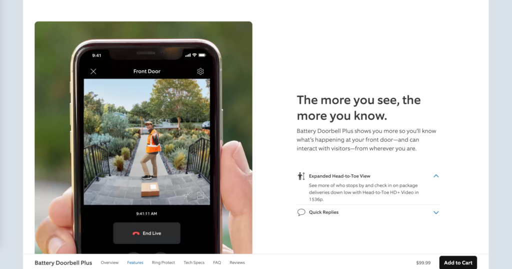
Best Practice: Ring demonstrates real-life use cases, such as monitoring a doorway via a smartphone. By showcasing "two-way talk" and live video, they translate "1080p camera" into the concrete value of "remote home security and communication".
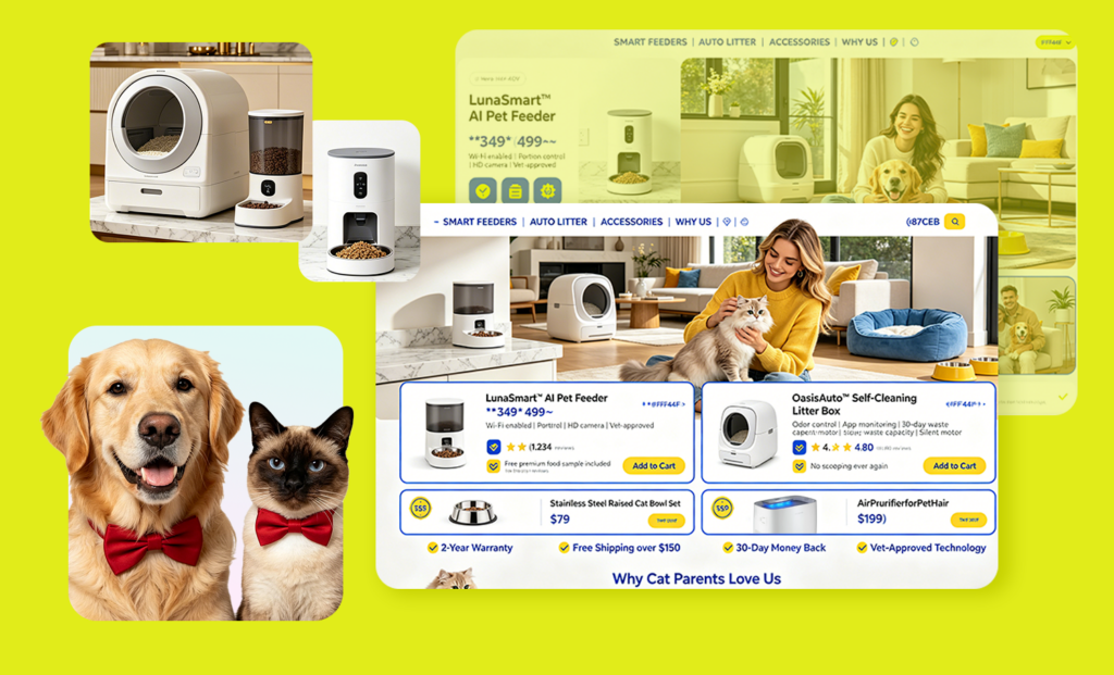
Also at high-AOV but primarily emotion-driven, we previously covered optimization for categories such as Pet eCommerce:
5. Smart Home: Lack of Real-Life Use Cases
Unlike skincare (before-and-after photos) or apparel (models with different body types), Smart Home brands often rely on devices against white backgrounds or screenshots of app interfaces. This might fail to answer crucial consumer questions:
- What does the system look like in a daily routine: "How does the lighting look in an open-plan living room?"
- How the devices integrate visually: "Does a metallic smart panel blend with a Japanese-style interior?"
- What the actual user journey is: A video demonstration showing the full process from opening the app to setting a "scene mode" helps users understand the learning curve.
6. Information Architecture Hinders Product Comparisons
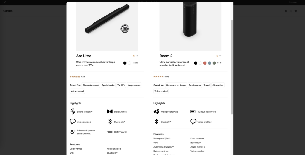
Another common friction point in the Smart Home sector is the difficulty of comparing products. When a brand sells entry-level, mid-range, and flagship models, the consumer’s primary question is: "What are the core differences, and which one fits my home?".
Most comparison tools are either missing or organized by technical parameters rather than user needs. This forces consumers to manually organize information, increasing the likelihood they will leave to check other platforms.
Best Practice: Sonos organizes its comparison tools by usage scenarios, using labels like "Good for Large Rooms" or "Good for Travel". This translates technical differences into situational differences, significantly lowering the decision-making barrier.
TMO's New CRO Pilot Program for Info-heavy Products
Improving your conversion rate from 2% to 3% results in a 50% increase in orders without any additional customer acquisition costs. For brands with stable traffic, the ROI of CRO often far exceeds that of additional ad spend.
TMO Group is currently offering a zero-cost CRO Audit for eligible D2C stores. You will receive:
- Conversion Barrier Analysis: Locate where and why visitors drop off.
- UX & Usability Assessment: Identify friction points in the user journey.
- Annotated Screenshots: Visual breakdowns of key issues with clear explanations.
- Prioritized Action Roadmap: A plan sorted by impact and effort.
- Quick-Win Recommendations: Immediately actionable improvements.
If you want to identify the biggest friction points across your key pages and turn them into prioritized actions, you can learn more and apply for the pilot here:

Frequently Asked Questions (FAQ)
A lack of spatial and tactile context. When users can't visualize scale, texture, or how an item fits their room, they hesitate to buy.
Because of the long decision cycle. Users in the research phase need buying guides, expert reviews, and styling tips to move from "browsing" to "buying".
Specs are too abstract. Average users don't care about "protocols"; they care about how the technology improves their daily life.
By translating jargon into "life results" Show the specific scenario and benefit rather than just listing technical parameters.
It’s a high-consideration purchase involving budget, style, and logistics. The goal of CRO isn't to force an instant sale, but to stop high-intent users from leaving due to poor site UX during their research.
Furniture focuses on visuals and space (e.g. "Will it fit?"), while Smart Home focuses on value and scenarios (e.g. "How does it change my life?").
A redesign makes a site "look better," while a CRO audit ensures it "sells better" by using data to provide the right info at the right time. Always diagnose with an audit before you invest in a redesign.