


The navigation of the website just like the foundation of the house. It takes the risk of whether the website would success. You need to spend a lot of time on users requirement, the content of the website and the structure. And the navigation is one of the most important things at the beginning which should be taken into consideration.
Today let's talk about 3 tips on how to design an efficient navigation, which would help to build excellent user experience, high conversion and sales.
What is a navigation
Some people think that the navigation should be the focus of the site. Visitors should be able to find what they want easily. And some people think that the navigation could be a tool which is used to guide visitors.
Actually, like the design field, there is no “rule” for how to design a navigation. Every website has their own targets, requirements or operation modes. But their principle seems to be similar: build a successful site.
1. Information architecture
Information architecture is like a bridge that can link information and user's cognition. What's more, we need to learn how the website looks like from user‘s point of view. You could ask yourself some questions below:
- Which page is necessary?
- Does the page need to be update frequently?
- How many user groups?(Login account, Subscriber, Advertiser)
- What's the aim of these users?
2. Keep simple
As we mentioned before, How Should We Follow the Trends of Minimalist Web DesignMinimalism is one of the modern web design trends. It makes the web page looks clean. But actually it is hard to leave a blank.minimalist design is a trend. We shouldn't design a complex navigation.
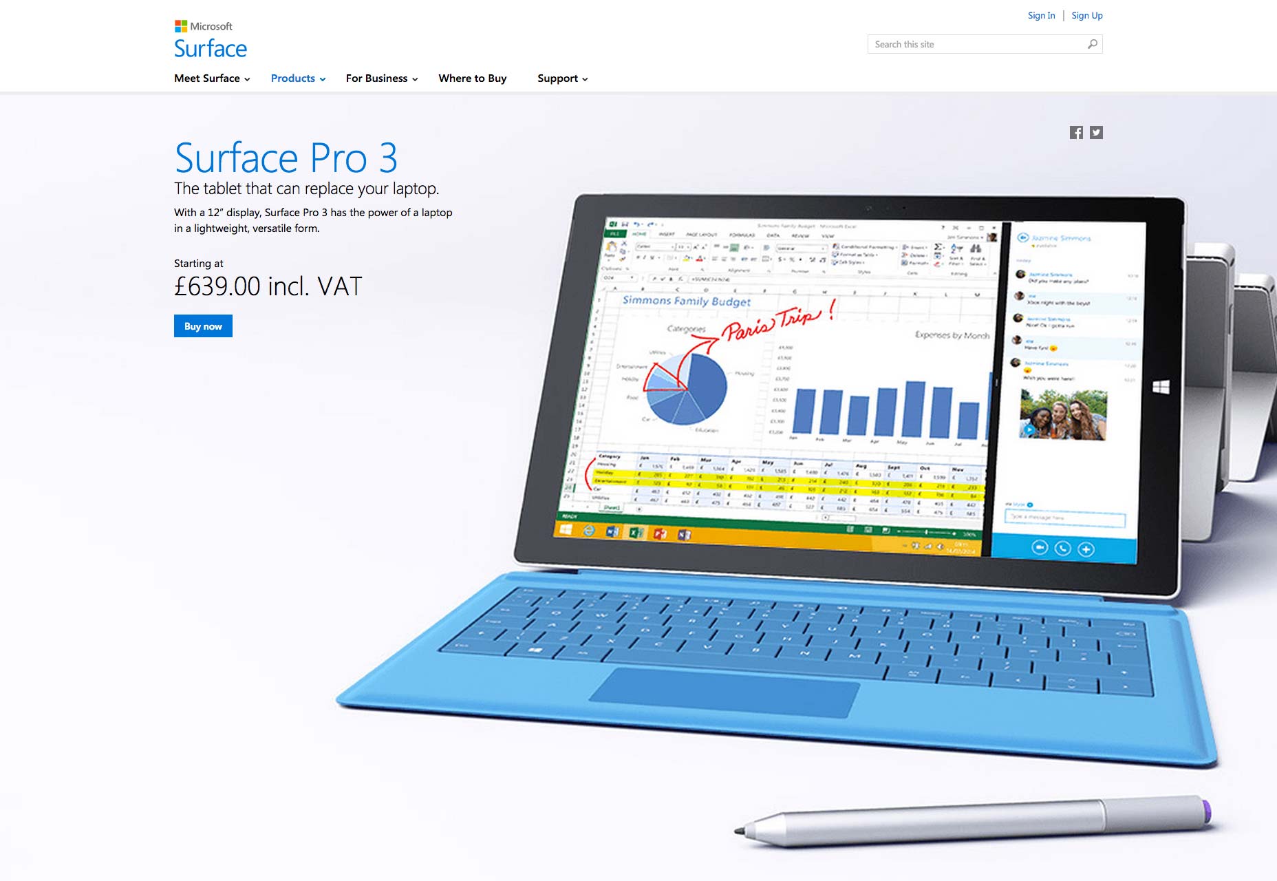
Take the homepage of Microsoft as an example. The navigation is divided into 4 parts. People can easily find what they want through the drop down menu. Even Microsoft has a lot of products, it looks clean enough.
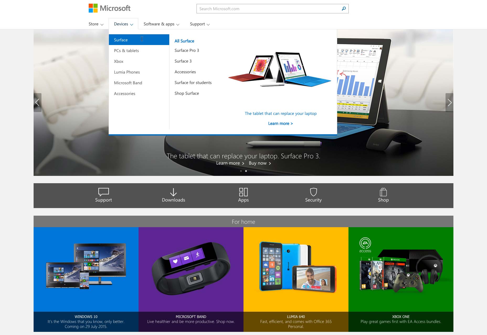
In sub-page, the navigation looks similar to homepage. Actually it has more options which focus on functions and services. Different menu makes it convenient to read and manage.
3. Direction
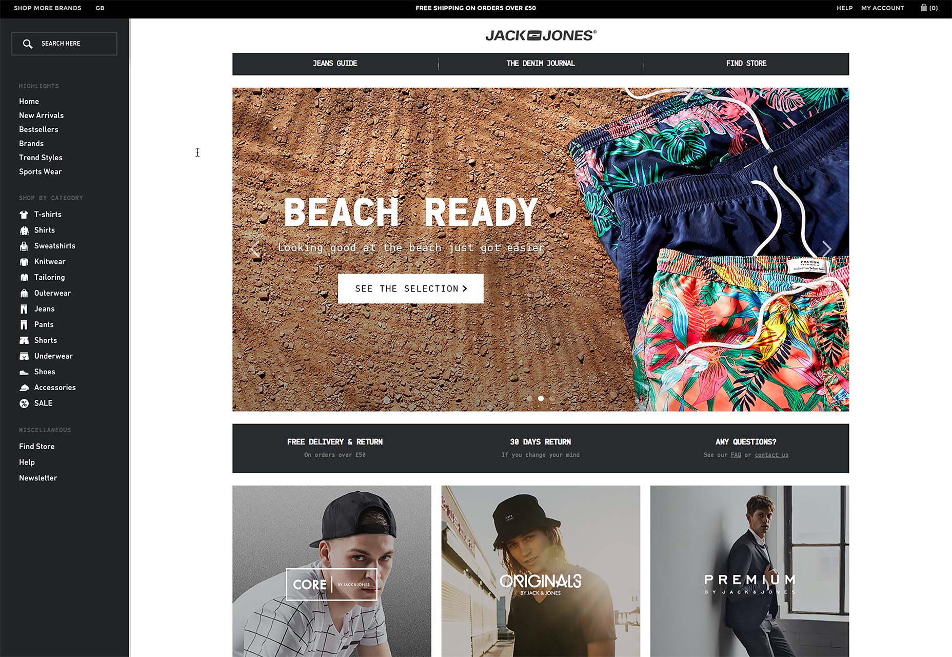
Basically, most of our screens are wide. As a result, most of the design is horizontal and looks good. But there are still some websites, especially for the navigation of eCommerce websites , who use vertical style. Because It's easy to classify products. We can study Jack Jones's website.
Conclusion
Rule is changing. Just like responsive web design makes it easy in terms of showing PC websites on mobile devices. Design will never be limited.


