


Responsive website design is a flexible layout that automatically adjusts to the viewer’s device (i.e. mobile, tablet or PC) and screen size. The pages adapt to the device they are being viewed on, perhaps also condensing and rearranging the elements of the page.
By this time anyone who is in the business of creating website presence on the internet has heard the term responsive design. The fact is responsive design in a must these days if you want your site to show up well in all manner of mediums, particularly mobile. And this is good, as more than half of all Web traffic is now at least originating on a mobile device of some sort, it’s high time to make sure your pages are rendering well.
Here are a few golden rules that can help you embrace an outstanding responsive website with a flair and boost your business values.
1. Evolve the right visual strategy
You need to consider the length of the page before you zero in on the images. Your strategy for presenting images needs to be based on these factors:
- Organization of the interactivities in your course and how the ocular elements fit into it.
- Presentation of the core-content on a smart phone. Many opt to load the key content first.
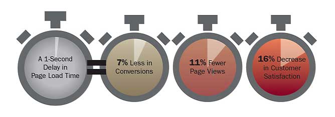
2. Ensure performance is your main goal
Irrespective of tremendously fast speed of today’s mobile devices, it is always recommended to build your website for gadgets equipped with slower internet connections. For instance, since 4G is restricted to just the modern countries, you need to pay special attention to designing mobile-friendly websites which can function flawlessly even on 2G and 3G networks. Ensure that the load time of the site is both, short and snappy.
3. Get Rid of Non-Essential Content
In order to make your mobile friendly responsive design site really shine in a very easy to achieve way, simply bear one thing in mind: Some content and content elements were never meant to be used in a mobile context and would never work there.
If you have these elements at play in your website or potential site layout, then get rid of them immediately for any mobile setting. You can do this by adding a .not_mobile class to specific elements that you’d like to see removed when your site is viewed in a mobile context or you can simply get rid of such elements permanently from all versions of your site.
4. Reap the benefits of Media Queries
Media queries in CSS3 offer great benefits that facilitate web content to respond appropriately by taking several aspects of a targeted device into account. It works proficiently to identify a few attributes of the targeted device like its resolution, orientation, width and height. Then, on the basis of this info, it implements the suitable CSS rules. Thus, media queries augment responsive design and play a significant role.

5. Javascript fallbacks
We all love beautiful transitions and animations that make websites a joy to experience. I believe these are important, and often necessary, polish items that can give context to the user when the navigation opens or content is revealed. However, keep in mind that you should implement fallbacks for those users with javascript turned off. I’ve seen a few examples of this where main navigation wouldn’t work with javascript off, which is obviously a bad thing.
6. Don't forget your calls to action
One very important item that often gets overlooked is the relative size and visibility of your calls to action on a smaller screen. Too small, they miss it, perhaps find the button too small to easily click. Too large and it becomes pushy. Test this and make sure you would find it appropriate as a user.

7. Avoid small fonts
Make sure your text can be read easily. Use a minimum of size 11pt font for body text and 22pt for headlines. We also recommend using a strong contrast of colors, like dark text on a light background. Many people turn down the brightness level on the mobile device to help conserve battery-and they are often reading on the go outside in the sunlight-so a strong contrast of colors will be easier to read.
9. About Updates
If your site is to be a one-off production then updates won’t be an issue but if you plan to build the site then hand it off to others for updates, make sure that it’s easy to do so. Include instructions for those who come after you. Make sure you place comments in the code along with written documentation so those who come after you can see what you’ve done. This will make it easier for them to make updates/changes as necessary.


