
Senior app design is becoming more relevant than ever. According to a recent Nielson Norman Group survey, the ability of users aged between 25-60 to properly utilize web pages and apps has dropped by 0.8% year-on-year. Meanwhile, middle-aged and senior users were found to 74% less efficient at doing the same than users in younger age brackets.
This is because it takes longer for these middle-aged and older users to identify the important or relevant areas of a page/app, distinguish each discrete part, and extract or understand information. Therefore, more and more companies are looking to tackle this usability gap through tailoring their pages/apps specifically to older demographics.
This article focuses on senior app design and development principles. These are used to help middle-aged and senior users to get the most out of eCommerce.
Intergenerational Challenges Facing Older Demographics
Even those who grew up in the Internet-enabled era and so consider themselves fairly tech-savvy, decline in physical ability affects us all and can leave us on the back-foot technologically.
Vision
As we get older, our corneas, lenses and retinal cells suffer. Our ability to distinguish and recognize color weakens, what was bright becomes dim, and small visual distinctions such as those between different fonts become hard to perceive. These can make traditional user interfaces (UIs) more difficult for middle-aged and especially senior users. Senior app design should focus on making things clear no matter the reader's visual acuity.
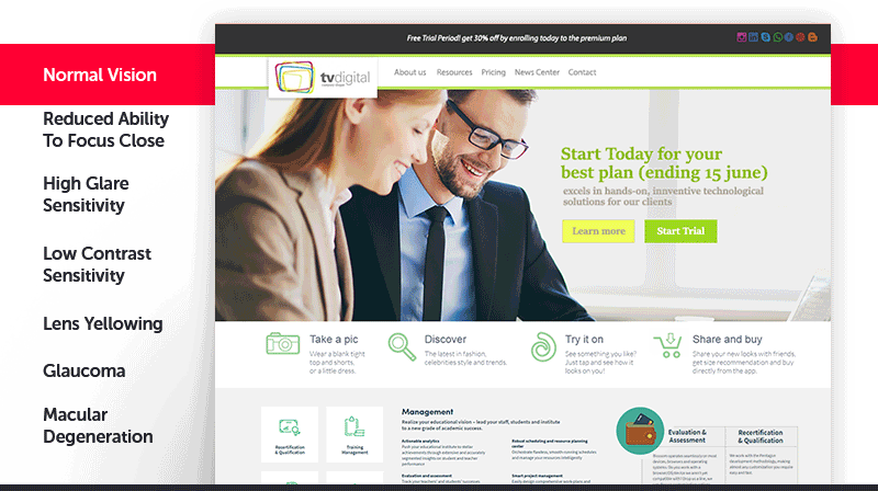
Some ways that different vision impairments can affect UI visibility
Movement and Hearing
Most older people suffer from issues with fine motor control and hand-eye coordination. Hand tremors, arthritis, and other health issues can make the precise interactions some traditional UIs require more difficult, making navigation slow and frustrating. Similarly, hearing loss can mean that some seniors require information to be delivered at volumes ten times as high as younger users.
Memory and Comprehension
Short-term memory tends to decline as we get older. Similarly, concentration becomes more difficult, and it gets easier to become distracted. This makes multi-step processes or more complicated interactions difficult for older users.
Design Principles for Older Users
Enhanced Color Contrast
The loss of color perception can be far more dramatic than some younger people believe. Increasing color contrast is therefore a powerful tool for making UIs more easily readable by older users.
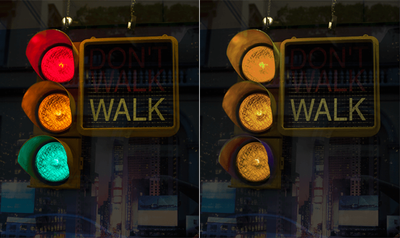
A traffic light's red, yellow, and green as viewed by a young and visually unimpaired person (left) versus an older person with some vision loss (right)
So what kind of color palette and contrast are suitable for older users? We recommend sticking to W3C design standards while retaining your brand's colors as much as possible.
For ordinary users, the lowest recommended level of text and visual contrast is 3:1.
For middle-aged users, this contrast should be increased to around 4.5:1, while for senior users a contrast level of 7:1 is a better minimum.
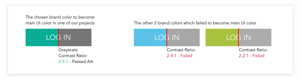
A design example from TMO. We sought a color with great enough greyscale contrast in order to make it easy for senior users to see properly.
In addition, we need to ensure that in greyscale conditions, middle-aged and older users can still clearly distinguish colors and different elements. Blues can be an issue, as middle-aged and senior people's eyes often only selectively absorb blue light, making it harder for them to distinguish between blues than it is for them to distinguish between reds or greens.
Using Words and Fonts to Your Advantage
The typical font sizes used for mobile apps and websites are 11-12 pixel fonts. This can actually be difficult to read with younger users with poor eyesight, so it should come as no surprise that middle-aged and older users struggle with these font sizes. TMO recommends upping font sizes by at least 50% for senior app design, to a minimum of 16px.
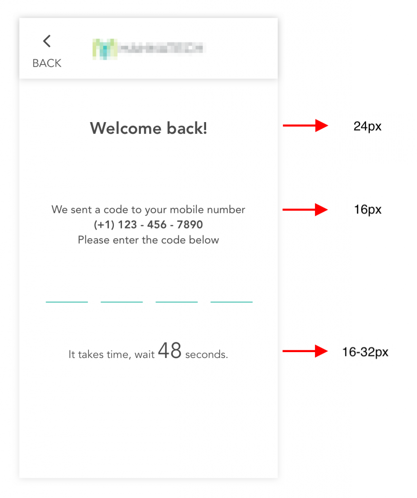
An example design from TMO. Here, fonts are enlarged far beyond regular standards, to make them easier for seniors to read.
Beyond size, we also recommend avoiding thin, sans-serif fonts. These tend to be harsher and less friendly, as well as potentially causing readability issues. Another issue is text within images. Degraded eyesight can lead to text and images 'bleeding' into one another, so such elements should be kept apart.
Unlike younger users, middle-aged and senior users tend to take longer to comprehend, accept, and trust the things they read. This is in part because they read things more slowly and carefully. Therefore, in our designs for such users, we at TMO made use of detailed descriptions to leverage their willingness to read more text to help them understand and trust our services. For example, adding more thorough instructions throughout a sign-up process to explain each step in detail.
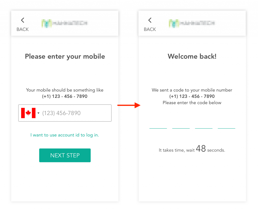
An example design from TMO. The UI presents more detailed instructional text to the user during the registration process.
Minimized Gestural Interactions
Alongside declines in hand-eye coordination and short-term memory, seniors often lose motor skill speed and precision required to interact with modern systems. What are simple gesture interactions for younger users can be genuine obstacles to older users. For older users, we recommend keeping things simple by making interfaces 'click only'. Button size is also important in senior app design. We have found that a button size of at least 44x44 pixels ensures a comfortable clicking experience on any screen size.
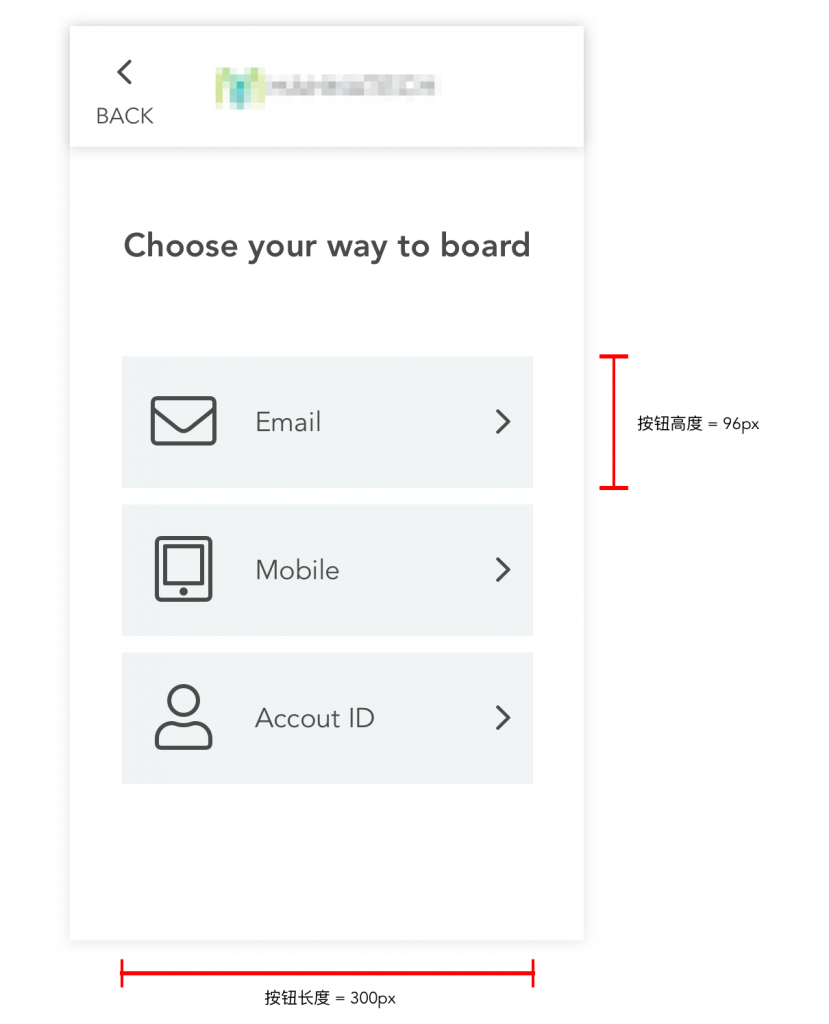
An example design from TMO. Here we used large buttons that are easy to read and easy to click.
Simplified Product Design
Keeping product design and navigation simple reduces barriers to entry and smoothens learning curves for older users. This doesn't just lead to older users picking up the relevant muscle memory quicker. It also grants them more confidence in using their device and your product in particular.
It is also important to streamline all important, relevant information onto a single screen. Page scrolling and split-screen operations make navigation more complicated and frustrating for many senior users.
For senior app design, we suggest keeping the following nine principles in mind:
- Navigation should be simple, clear, and coherent, with consistent conventions and processes throughout.
- Operations and navigation should be as 'flat' as possible, avoiding hiding content too deep into the system.
- The screen should make it as easy and quick as possible for users to 'scan' and identify key content, and then navigate there.
- The user's location within the process, as well as how they can return to the previous page or beginning of the process, should be absolutely clear.
- The title of the topic or process should be clear, consistent, and visible at all times.
- Backgrounds should be simple and not distracting.
- Experimental, unusual, or innovative UI or UX elements should be avoided, as they can be confusing.
- Visual feedback should be given on completion progress and requirements.
- Simple sound effects can accompany and assist in conveying information, such as being played upon completion of payment.
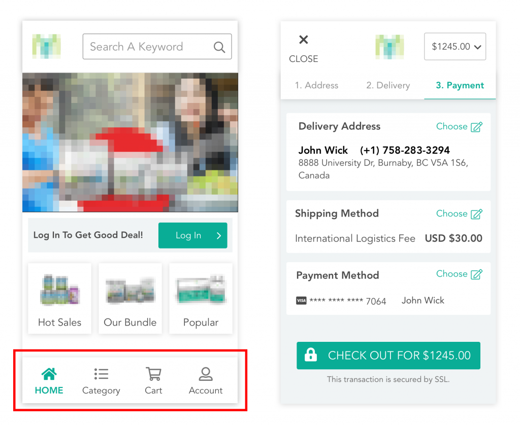
An example design from TMO. A streamlined interface for senior users.
Although cognitive decline and comprehension difficulties are a natural consequence of aging, this does not mean that senior users are unable to learn new processes. Given careful and considered instructional content, these users are able to master new UIs and systems and fully take part in modern eCommerce.
The Value of a Human Touch
In the coming years, middle-aged and senior users will have widely varying levels of familiarity with modern technology. However, our fundamental principle is that all content should be suitable for beginners. With strong senior app design that empowers users of any amount of experience, we can bring confidence and reassurance to a process that can otherwise feel daunting or frustrating.
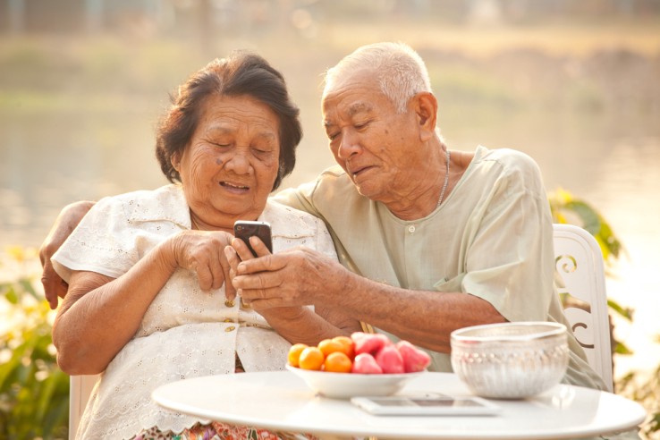
Elderly users enjoying the online shopping experience from their personal mobile phone.
We believe that the industry needs to combat middle-aged and older users questioning and doubting their own abilities. The elimination of both errors in design and the potential for errors on the part of the user is vital. Clear and comprehensible are more effective than beautiful. Practical is better than pretty. Senior app design elements should not primarily serve to look pretty, they should fulfill their function as best they can.
Senior App Design Principles are Universal Design Principles
This era of digital dominance has led to a state of 'digital fatigue' in many young users. These tech-savvy users are increasingly feeling drained by an over-abundance of digital content. As a result, it can be hard to encourage them to interact with your product or service.
When investigating this 'digitally fatigued' crowd of young users, we noticed a number of parallels with senior users:
- Don't want to read VS have trouble reading
- Can't be bothered to scroll VS can't scroll
- Too lazy to learn VS find it hard to learn
So how can similar design principles to those used when working with senior users help us to reach these 'digitally fatigued' young users? TMO has been focusing on the following avenues:
- Quickly and clearly communicating the most vital information through adjusting sizes, word counts, visibility, use of images, etc
- Combatting visual fatigue using strongly contrasting colors
- Facilitating product, service, and experience comprehension and navigation
- Keeping complex gesture inputs to a minimum
TMO Group focuses on eCommerce design and development across multiple cultures and demographics. We will be releasing more senior-focused products in the near future, and anyone interested in investigating this avenue for their own brand or business can contact us at info@tmogroup.asia or take a look at our solution services page.