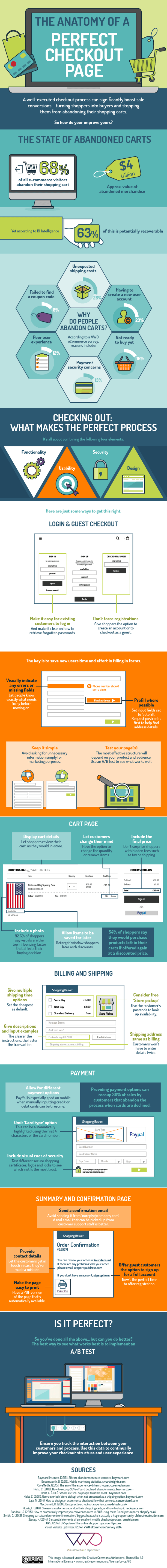

At some point, you’re going to ask your online visitors to submit payment. And your payment submission page, a.k.a the checkout page, has to be in tip-top shape if you want healthy revenue growth.
Visual Website Optimizer, who brought us many gems of content like the eCommerce survey, now bring us this infographic about the perfect checkout page. It lists the four strategic areas addressed by the How can Make eCommerce Checkout Easier: 4 tipsCheckout is an important part of any eCommerce user journey. How can you make it as smooth of experience as possible? Here are 4 suggestions.perfect checkout process: functionality, usability, security and design. They are explored in helpful detail and accompanied by tactical suggestions.
For example, do your customers have to create an account if they want to complete a purchase? You better think twice about this requirement. You can harm conversion rates by adding a few extra buttons to click or forms to complete.
Did you know that 30 percent of card declines can be saved by offering additional payment methods in your checkout page? Do not leave your customers hanging there with their pockets out. Include regional alternative payment methods to capture even more customers.
Do not underestimate the impact a confirmation page has on usability. It is an essential reference guide for your customers, so make sure it goes to the right email address, and include contact information in case your customer needs to get in touch.
This infographic also comes with excellent sources listed at the bottom. Dig through them to find useful information about conversion optimization from reputable sources like the esteemed Baymard Institute and conversion rate optimization expert Justin Rondeau.
What have you done lately to 4 Golden Rules for eCommerce Checkout DesignCheckout is one of the most crusial stags of online shopping - so many things can go wrong here. Here are golden rules to remember.create the perfect checkout page? Share your tips in the comment section below.