
A word said that designers will never meet everyone's need. To be honest, they should indeed become geniuses. Sometimes clients and developers may misunderstand the design process. And they may also question our ideas when we try something new. Everyone makes mistakes. As a result, we list 3 fatal mistakes in user experience design and go as follows.
1. Design for yourselves
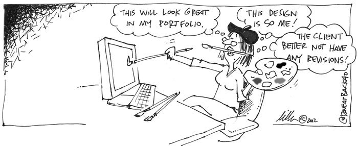
We should be ashamed of our proud. Especially when we work in some special fields. More or less we have some deep-rooted ideas and we try to avoid some truth. As an excellent designer, we should stop enjoying ourselves. Our main goal is to create an unforgettable experience for clients.
To a certain extent, we all have responsibilities to our work. But we should be more responsible for clients than ourselves. The following 5 tips may help you in your design process.
- Think about users in each phase.
- Create a tourist map and think about how will different users use the site.
- Know our audience and meet their need.
- Use different devices in testing. Or test with actual users if possible.
- Make use of A/B testing for buttons, colors, texts or images.
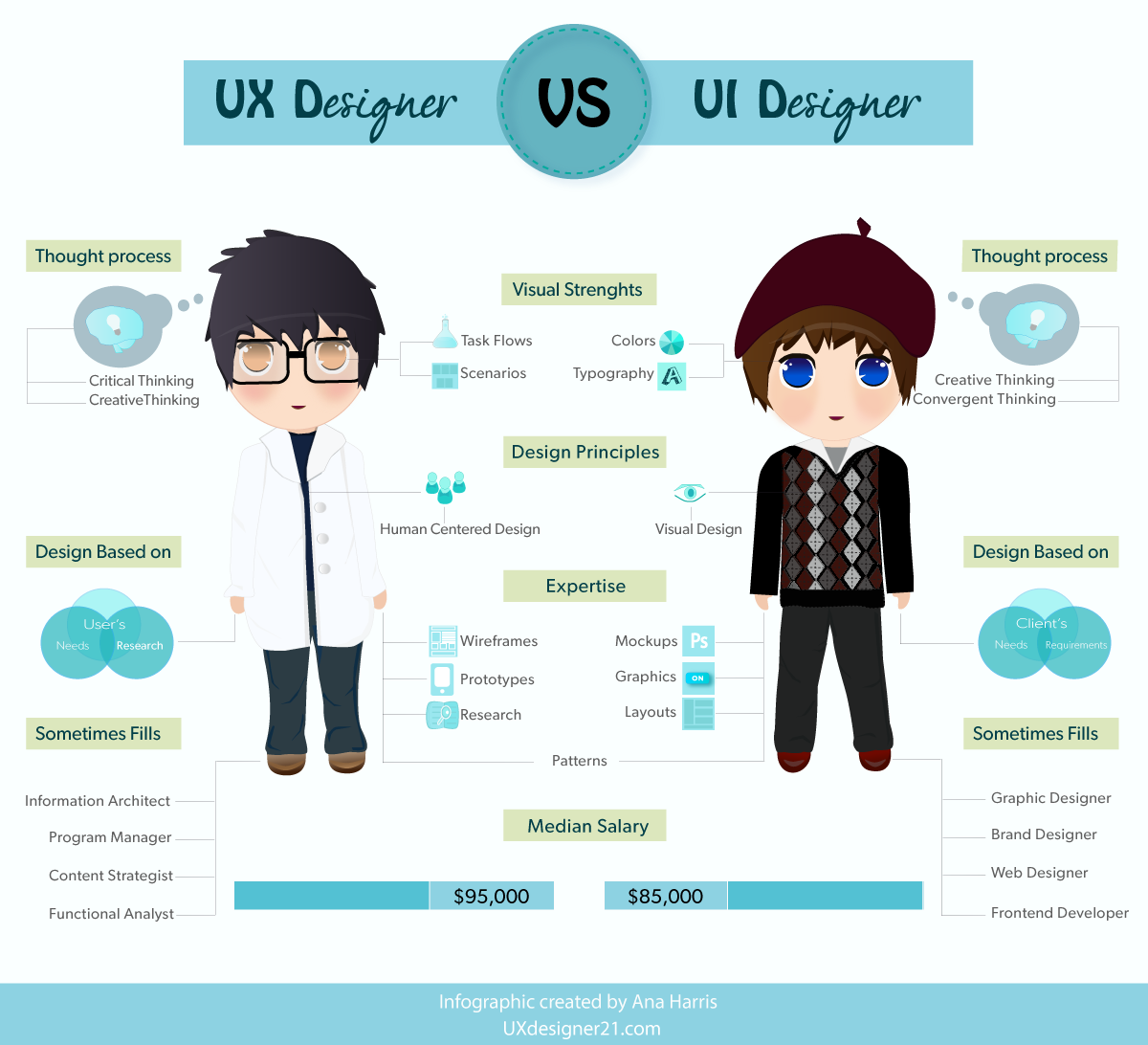
2. Mix UX with UI
Its a common mistake that sometimes we confused UX with UI. UX should focus on interactive with users. And UX designer should create a comfortable environment for users. But UI designers are more focus on the appearance. They should guide visitors and tell them where to go and which button is clickable. In general, a beautiful interface doesn't means it works well. So the sequence of web design could be:
1) Content structure
2) Interaction design
3) Visual design
The reason why we put content at first because that content is king. Users usually pay more attention to content. As a result, we should improve our visual design based on a good content structure.
3. Ask too much information
Believe it or not, users are lazy. The more type of design you give, the less motivation they get.
There is an interesting investigation for register. Normally it can requires name, company, address, city, province, zip code, telephone, email, comments and so on. And after we only keep name, telephone, email and comments, the register rate increased 40%. Moreover, the quality is nearly same with before. As a result, we should get the information which we really need. And we can also do some A/B testing by delete or add some forms.

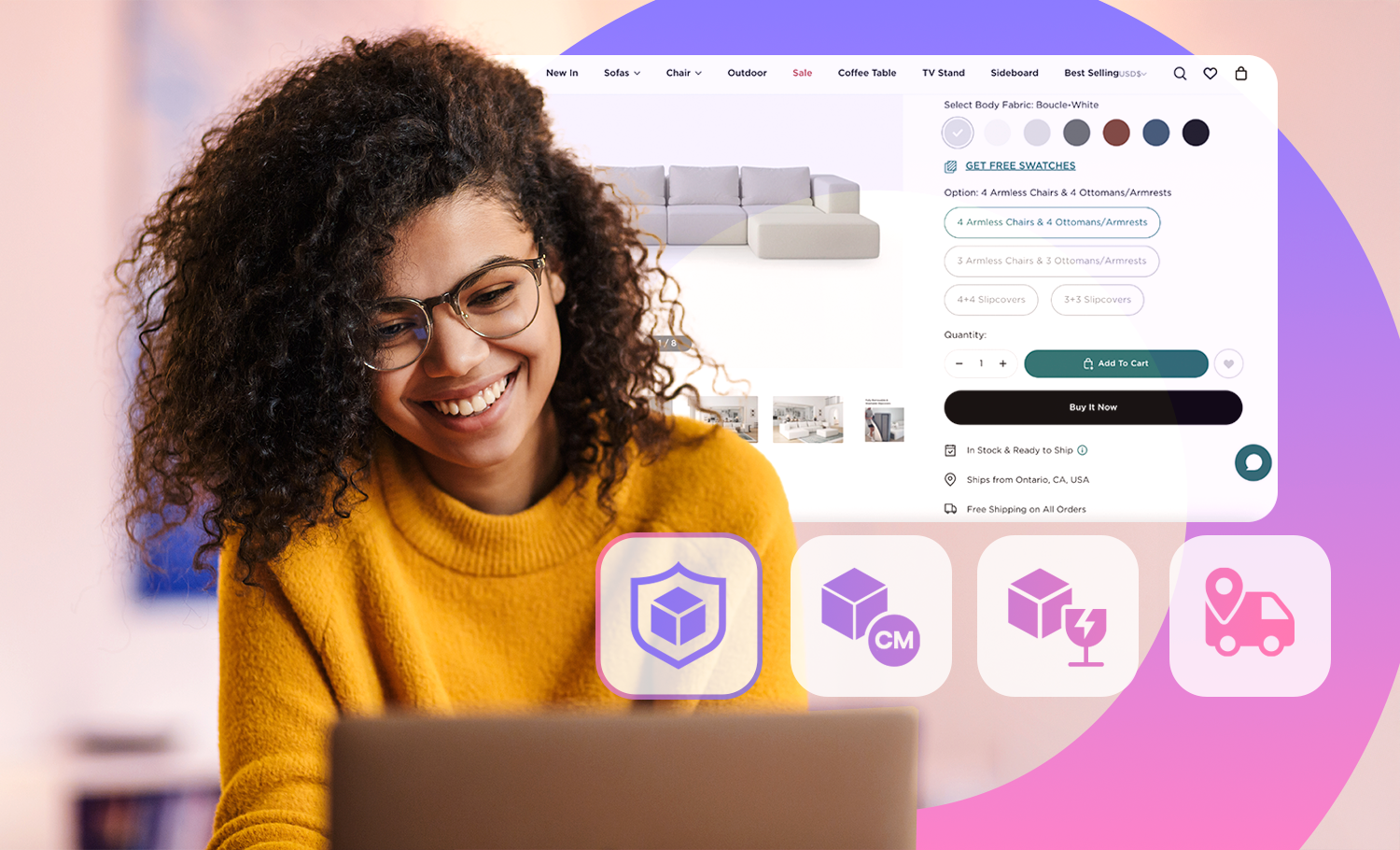
Above all, the design should be able to build trust and stimulate emotions. You can also read some of our helpful articles: 10 Relations Between Interaction Design and PsychologyOne thing relevant to interaction design is the study of Psychology. It can help designers to understand what are users requirements as well as bring new ideas10 Relations Between Interaction Design and Psychology or How to Consider UX in eCommerce Website DesignAn eCommerce website with good user experience can easily convert visitors into buyers. Today we'll discuss 4 aspects of eCommerce user experience design.How to Consider UX in eCommerce Website Design .