

Before designing some eCommerce website pages, nearly none of us look at theories about how to match colors, which probably makes us bored. But after that, reviewing these theories sometimes can inspire us. In this article, we'll avoid telling some boring theories and give some useful tips on how to match colors for good looking web pages.
Color matching ratios
A Japanese designer even put forward a golden ratio to match colors, which is 70:25:5. That means 70% of the page uses the main color, 25% uses subordinate color, and 5% uses the ornament color. Normally, the color quantity should not be more than 3 (dark red can be considered to be red).
To be honest, using colors, the less, the better. It makes the page clean and mature. Except for some holiday posters, more colors will make it lively.
The relationship of colors
Matching colors is a process which depends on the color's position in the color ring. The contrast will get smaller along with the angle getting smaller and vice versa.
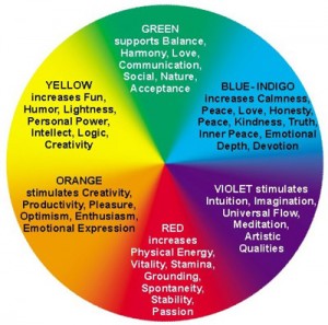
There are 6 colors we need to remember in our mind: red, orange, yellow, green, blue and purple. All colors can be made by mixing these 6 colors. The following are some common ways to match them.
Match colors with neighbors
According to the color ring, this kind of matching could be red+orange, orange+yellow,yellow+green..and so on. It creates a warm feeling. It also weakened the visual impact. Here are some examples:

The character's color is similar to the background. It looks comfortable and elegant. Characters are converted to word art, which are in harmony with the style.

This poster uses the matching "red+orange". Orange is the main color. Combining light orange and dark orange makes a sense of hierarchy. The person's surprised expression makes it filled with energy.
One color interval
According to the sequence, we can use the matching "red+yellow", "orange+green", "yellow+blue" and so on. The visual impact is stronger than using neighbor colors. Especially for the trichromatic color including red,yellow and blue. Mixed with these three colors are widely used and popular.

This banner mainly uses the trichromatic color. Blue is used as a contrast. It has a good sense of spacing.
For "red+blue", it is the most popular matching that many designers use. These two colors have a strong contrast. What can you remember for this matching? Here are some famous logos:
![]()
![]()
![]()
Complementary colors matching
From my point of view, matching two opposite colors in the color ring is dangerous for any eCommerce websites. But some experienced designers can handle it very well. One important thing should be kept in mind if we use this kind of matching. We'd better choose a main color. Otherwise it may make it uncoordinated.
In short, the wider the angle, the stronger the contrast in the color ring. Although practises are based on theories, our imagination should not be limited, isn't it?
TMO Group is a web technology company in China. We provide eCommerce website development from early stage design to long-term maintenance. Send us an email to communicate with us!