Many international well-known brands opt for Adobe Commerce/Magento to create their own independent e-commerce platforms and expand their reach in the Chinese market, in addition to mainstream domestic e-commerce platforms like Taobao and JD.com. These international brands follow a “Glocal” strategy (Global + Local) that focuses on global localization. In creating a unified global brand image, they also take into account local cultural characteristics and Chinese user habits, incorporating them into the visual designs and interactive experiences on their official websites.
In this article we will explore 6 perspectives on how international brands optimize their website’s UX/UI design to cater to the needs of Chinese customers.
*Adobe Commerce, the heir of Magento Commerce, which in turn was the enterprise version of Magento 2, is the market leader in eCommerce development technology. Adobe Commerce/Magento 2 provides a range of powerful features and tools to help companies quickly build efficient, scalable, customizable, and localized eCommerce platforms, allowing them to expand their overseas markets and sales channels quickly.
1. Optimize the interaction of the navigation bar and implement a sticky design
The navigation bar is crucial as the first element users encounter on a website. Many international brands, such as Microsoft and HP, improve the user experience for the Chinese market by adding a sticky design to their navigation bar. This design feature enhances accessibility and convenience, and improves the user experience:
- Enhance usability: Sticky navigation keeps the main navigation menu or bar visible and accessible to users at all times, regardless of where they are on the page. This improves navigation and makes it easier for users to find what they are looking for, without having to scroll back to the top of the page.
- Elevate aesthetics: Incorporating a fixed navigation bar at the top of the page can enhance the aesthetics of the website, providing a neat and consistent appearance across all pages. This approach also prevents the navigation bar from appearing and disappearing during the user’s browsing process, reducing clutter and improving the overall user experience.
- Boost brand recognition: A sticky navigation enables users to easily identify and remember the brand, ultimately strengthening brand recognition and influence.
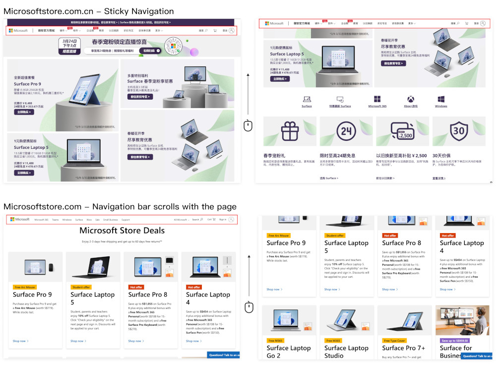
(1 Microsoft US store navigation VS Microsoft China store navigation )
2. Designing with culturally relevant images
- Banner design with local festival & event elements: Incorporating elements related to local festivals and events into visual design can create a friendlier and more intriguing look and feel that better caters to the interests of Chinese customers, meeting local marketing demands and increasing brand exposure.
For example: the banner design for the ‘Back-to-school Season’ campaign.
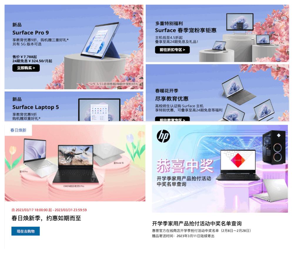
(2-1 Microsoft and HP incorporate localized marketing images on their online stores in China)
- Incorporate more images featuring Chinese faces: Including images with Chinese faces can build a stronger emotional connection with local users, as they tend to be more familiar and relatable to Chinese customers. This approach can help international brands establish a more localized image in the Chinese market, increase brand credibility and affinity, and strengthen the emotional connection between the brand and its users.
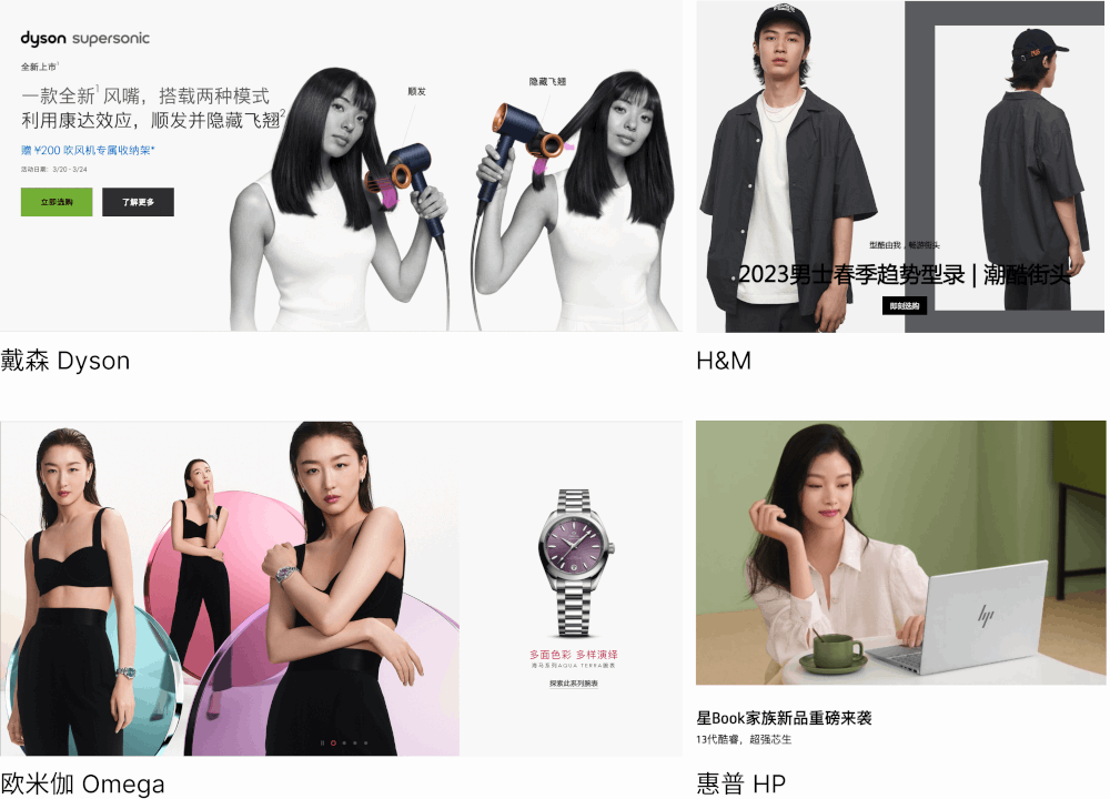
(2-2 Famous brands incorporate more images featuring Chinese faces in Chinese websites visuals)
3. Optimizing product card design
Optimizing the design of product cards is essential in the design of e-commerce websites, as they play a crucial role in users’ purchasing decisions. In the Chinese market, consumers are used to gathering as much product information as possible within a limited card space.
For example, the ‘HP China Official Online Store’ has optimized the layout of its product cards compared to the simpler layout of the overseas version, such as the following improvements:
- Highlighting the display of status and activity information with different colors
- Using clearer card partitioning to optimize information hierarchy
- Using direct and understandable text descriptions to emphasize discounts can make the price more attractive to consumers
- Incorporating mouse hover interaction to highlight the product key feature
- Increasing the size of the ‘Buy’ button to emphasize this call-to-action
- Using a white background for a fresher visual presentation
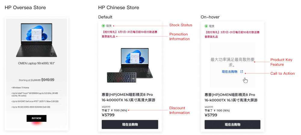
(3 Product card comparison)
4. Adding floating entrance/sidebar
- Floating customer service chat entrance: Chinese users are more accustomed to receiving instant customer service via chats. By having the chat widget always visible, it can encourage visitors to ask questions and get easy access to obtain after-sales and consultation services.
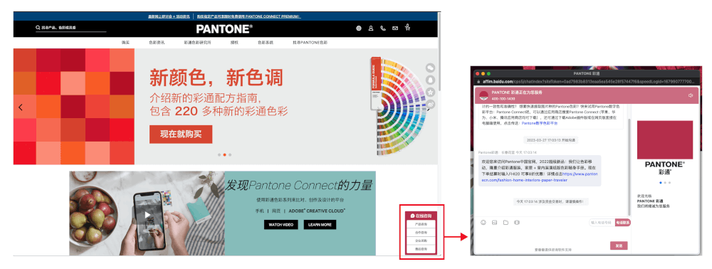
(4-1 Floating customer service chat entrance)
- Floating sidebar for the information display: The floating side information bar allows users to conveniently access contact information across channels and platforms. Especially for Chinese users, scanning QR codes to add contacts on WeChat, download apps, etc. has become an important part of daily digital life.
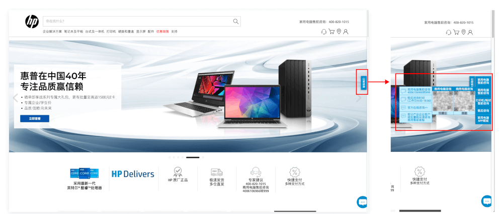
(4-2 Floating side information bar )
5. Optimizing font size selection for Chinese characters
Chinese characters are generally more complex than English letters, so they may require a larger font size to be legible. In web design, Chinese characters are typically set at a minimum font size of 11px, whereas English characters can be adjusted to a minimum of 9px.
E-commerce websites often contain rich textual information, making it crucial to optimize font size selection based on the characteristics of Chinese fonts to enhance content legibility and readability.
For example, the Pantone Chinese website has made additional font size adjustments for Chinese characters by increasing the font size, resulting in a more user-friendly browsing and searching experience.
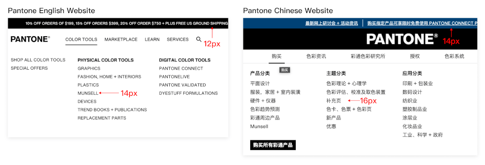
(5 English font size VS Chinese font size)
6. Optimizing mobile experience
In the Chinese market, there are a significant number of mobile device users who prefer mobile browsing over desktop, resulting in a surge in demand for digital experiences optimized for mobile devices.
By optimizing the mobile experience and creating a seamless user experience across devices, companies can improve user satisfaction, increase visibility, and boost conversion rates in the Chinese market, thereby better exploring this huge market.
Using Hamburger menu to efficiently save the screen space
The “hamburger menu” is a minimal three-line icon button, which is commonly located in the left/right corner of the screen. By clicking or tapping the button, it toggles between displaying the menu options and hiding them behind a simple symbol.
Using a hamburger menu is an effective way to use screen space efficiently, allowing users to focus on the main content and creating a streamlined, responsive navigation module.
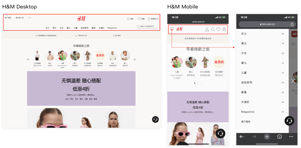
(6-1 H&M China Official Online Store: Desktop Navigation VS Mobile Navigation)
Optimizing layout & user journey caters to touch-based interactions
Mobile devices rely on touch actions such as tapping, dragging, and swiping, unlike desktop devices that use a mouse pointer for operation.
In mobile design, the use of touch-based user interactions can lead to a more seamless user experience. For example, the footer design in the “HP China Official Online Store” allows users to expand or collapse content by simply tapping on it while browsing on a mobile device. This results in a more efficient and streamlined page design.
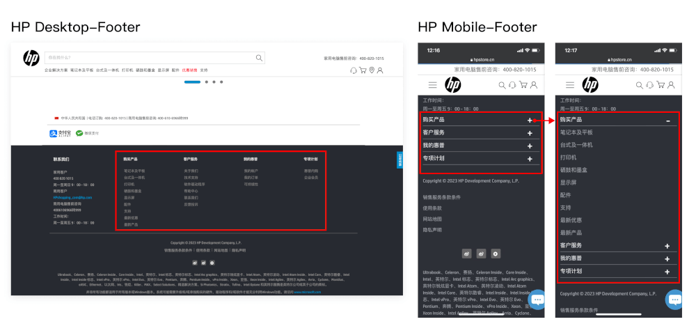
(6-2 HP China Official Website: Desktop Footer Design VS Mobile Footer Design)
Another example is the “H&M China Official Website, which utilizes swipe gestures to enable users to browse product categories and features. The site also includes progress indicators on the carousel, providing a clear indication of the current image and encouraging users to explore further by swiping left or right.
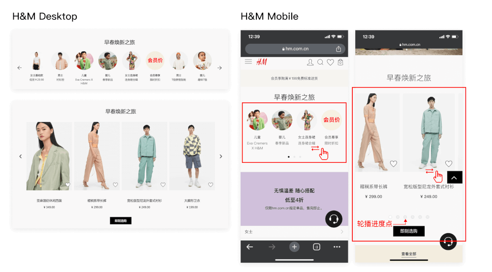
(6-3 H&M China Official Website: Desktop Product Entrance VS Mobile Product Entrance)
Using multiple screens to handle complex processes.
When optimizing the mobile user experience, it’s important to use multiple screens to handle complex processes. This means breaking down long or complicated workflows into smaller, more manageable steps, which can improve the user’s understanding and reduce confusion or frustration.
For example, on the product list page of the “HP China Official Website,” users can trigger the filter options page on mobile devices by clicking the filter button on the first-level page. This helps users complete the process clearly and quickly within the limited screen space of a mobile phone.
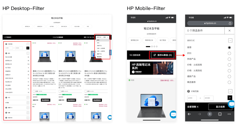
(6-4 HP China Official Website: Desktop Filter VS Mobile Filter)
Keeping the key CTAs in the Thumb Zone
“Thumb zone” refers to the area on a mobile phone screen that is easily accessible for users to tap with their thumbs. Placing buttons in this area on mobile devices can make operation more convenient and efficient for users, improving user experience and efficiency.
For example, on the product detail page of the “Microsoft China Official Website”, the key call-to-action button “Add to Cart” is optimized for mobile devices with a sticky bottom placement within the thumb zone. This allows users to easily make a purchase at any time while browsing.
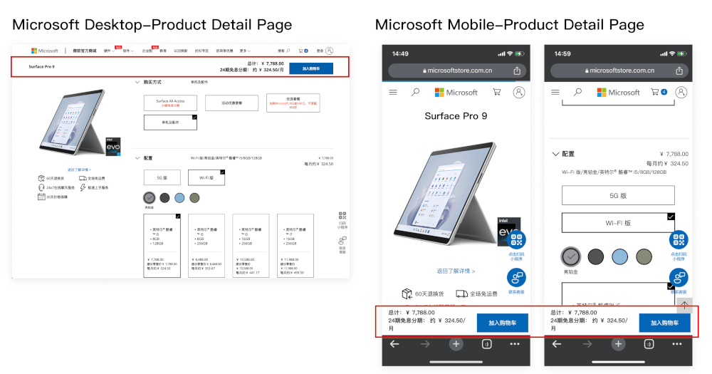
(6-5 Microsoft China Official Website: Desktop Product Detail Page VS Mobile Product Detail Page)
We hope this article has been helpful to you. TMO is an Adobe-certified solution partner, providing professional Adobe Commerce (Magento) implementation services with rich experience in local projects. If you have e-commerce platform development needs or want to learn about our services, please feel free to contact us!
Our successful cases include:
- Feidekai (Fitline)B2B2C solution for a new brand of dietary supplements, that include customer facing and dealer's apps to thrive in Chinese market.Feidekai: Custom B2B2C “new retail” eCommerce platform
- Henry ScheinHenry Schein China B2B eCommerce platform is a confident step forward on the company’s digital transformation journey. Read the case study.Henry Schein: B2B eCommerce platform for the world’s largest distributor of dental equipment and supplies.
